Important
You are browsing documentation for version 5.0 of OroCommerce. Support of this version ended in January 2025. Read the documentation for version 6.1 (the latest LTS version) to get up-to-date information.
See our Release Process documentation for more information on the currently supported and upcoming releases.
Content Widgets Management Concept Guide
Content widgets are predefined page components that display particular data on your website. Widgets help you design an advanced content on your web pages. Content widgets are self-updating content blocks that you can place to your website’s page, providing your customers with always new and fresh information.
In OroCommerce, there are multiple built-in system content widgets with different options that you can set to customize the widget as required.
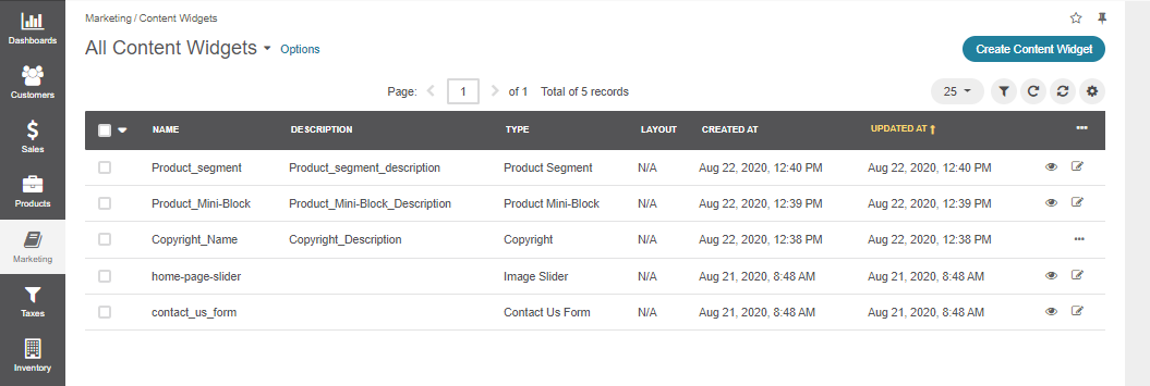
Each application can have a different set of widget types depending on the customization. With these types, you can create an unlimited number of widgets. Below are several default types:
An Image Slider — a content widget that enables you to add multiple image slides and configure their visual representation by setting the number of slides to be displayed, adding and formatting text, and setting alignment options.

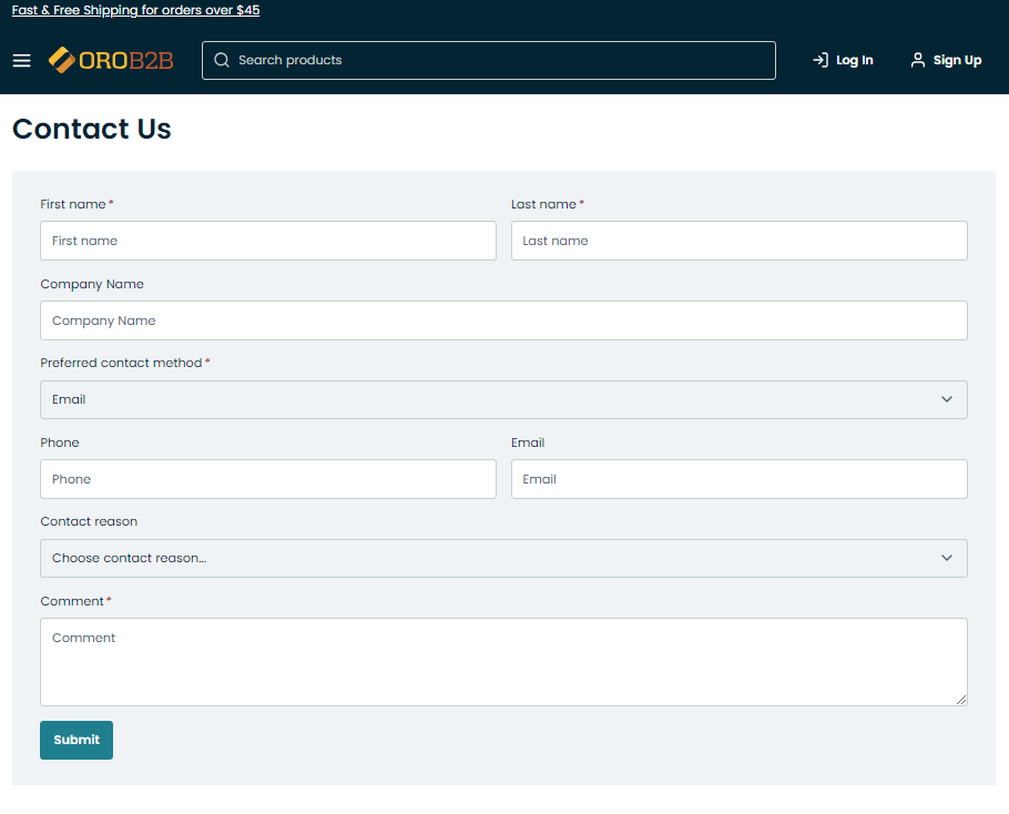
A Contact Us form — a standard Contact Us form that you can insert into any website page. The form is predefined by the system, so any changes or modifications to the form require developer’s assistance.
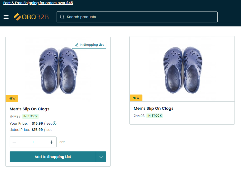
A Product Mini Block — a block with product information that you can insert to your WYSIWYG field. The block can include any product with or without prices as well as the Add to Shopping List button.
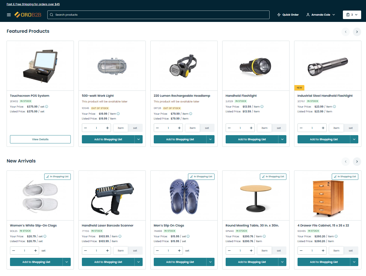
A Product Segment — a block with a certain product segment, either New Arrivals, Featured Products, or All Products that you can insert to your landing page or content block. This content widget enables you to configure the number of items to be displayed in the block, whether to use slider on mobile, and show the Add to Shopping List button in the storefront.
Hint
Check out the Manage Segments in the Back-Office guide to learn how to create new segments or modify the existing ones so that they can appear in the widget.
Add a Content Widget to WYSIWYG Fields
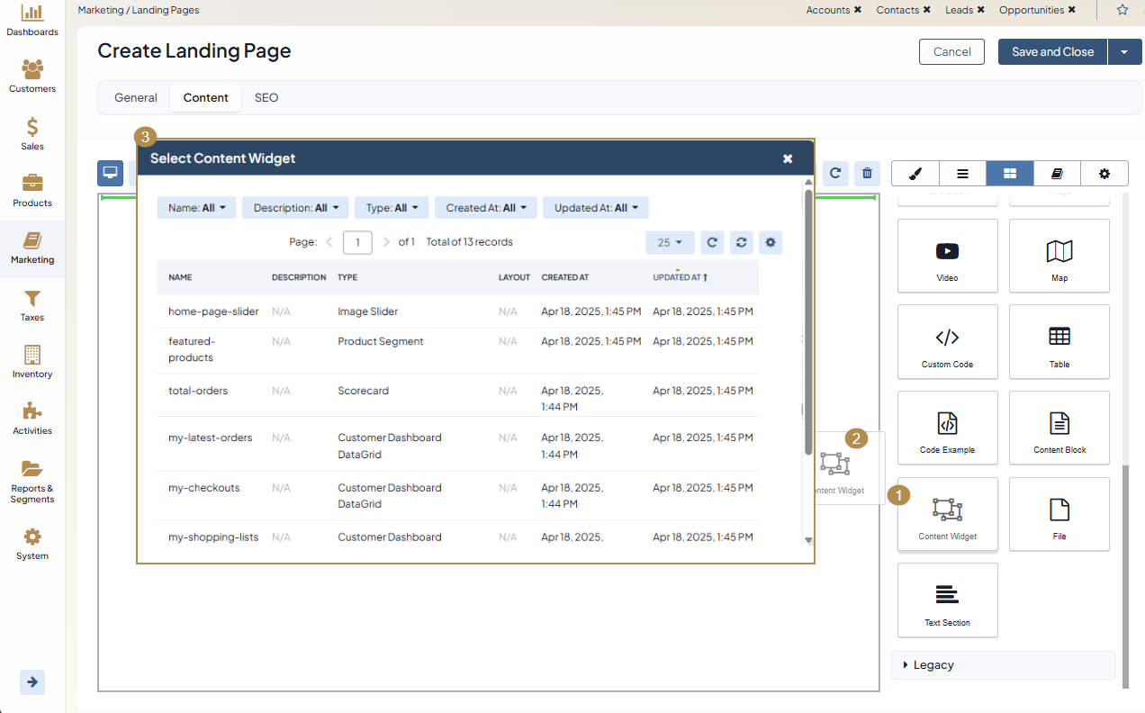
Once you save the content widget, you can now place it to the required location in the WYSIWYG field of your landing page or content block. To add a content widget to a field, drag it from the editor’s manager panel, and drop it to the desired location.
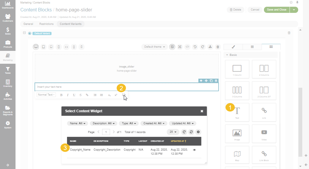
The widgets can be of two types, block and inline widgets.
Block widgets are added as a content widget block to a WYSIWYG field.
Inline widgets are added through the text block.
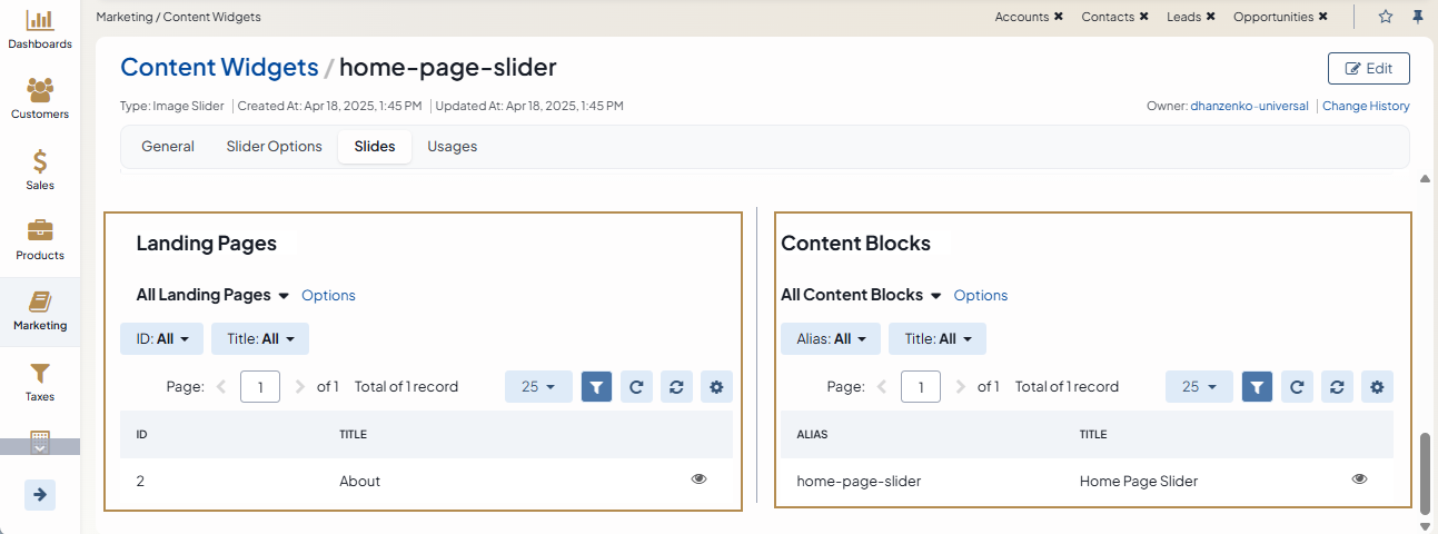
All landing pages and content blocks where content widgets were used, are displayed in the Usages section of each content widget.
Related Articles