Oro Frontend Stylebook
OroCommerce 7.0 LTS has introduced a new Intelligent Blue storefront theme in addition to the Golden Carbon and Refreshing Teal themes introduced in 6.1 and 6.0. The theme includes a fully editable homepage with configurable content templates and widgets, an improved and retina-optimized slider, product segment widgets and more. The theme has been designed to improve accessibility and internationalization, making navigation, search, and checkout experiences better, while also ensuring optimal performance.
To help you create your custom Storefront theme design, we compiled two files, the Style Guide and Design Mockups. To access these files, you need a Figma account with a Professional, Organization, or Enterprise plan. This will allow you to connect the library file to your working design files.
Note
These Figma files use the new Intelligent Blue theme, which is the recommended and most actively maintained theme for OroCommerce version 7.0.
The Golden Carbon and Refreshing Teal themes are still available in version 7.0. To see how they look in the storefront, please refer to the related Figma files: Style Guide 6.1 (Golden Carbon), Design Mockups 6.1 (Golden Carbon) and Style Guide 6.0 (Refreshing Teal), Design Mockups 6.0 (Refreshing Teal).
This Style Guide contains:
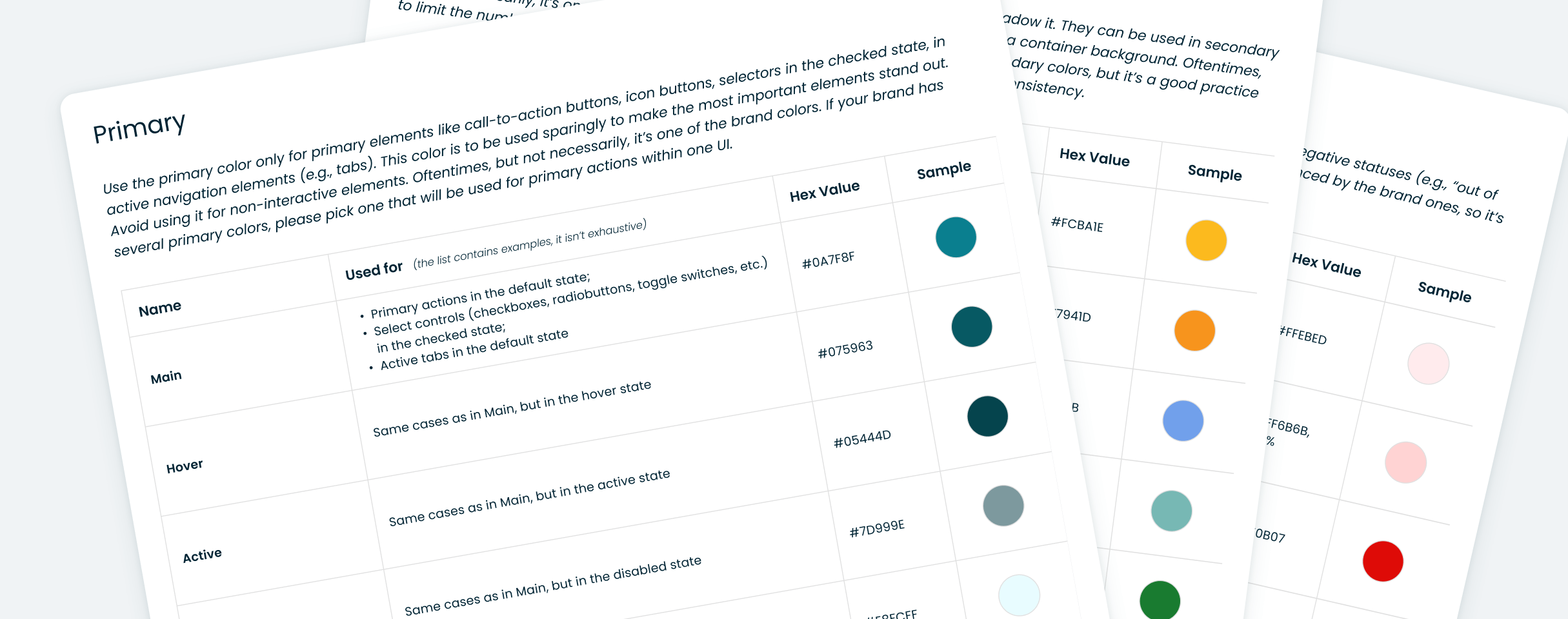
Styles with instructions on how to use them (colors, shadows and typography). You can change the styles to fit your company identity, publish library updates to your design work Figma file, and these styles will automatically be updated in every instance on every page that uses them.
Ready-to-go UI components, from the simple ones (e.g., Feather Icons, buttons) to the compound ones (e.g., product cards) that are built with auto layouts and according to the atomic approach.
Design Mockups encompass all primary screens and page components, allowing for customizable design alterations.
For more information, see the Storefront Design: Style Guide.