Important
You are browsing upcoming documentation for version 7.1 of OroCommerce, scheduled for release in 2027. Read the documentation for the latest LTS version to get up-to-date information.
See our Release Process documentation for more information on the currently supported and upcoming releases.
Storefront Design: Style Guide
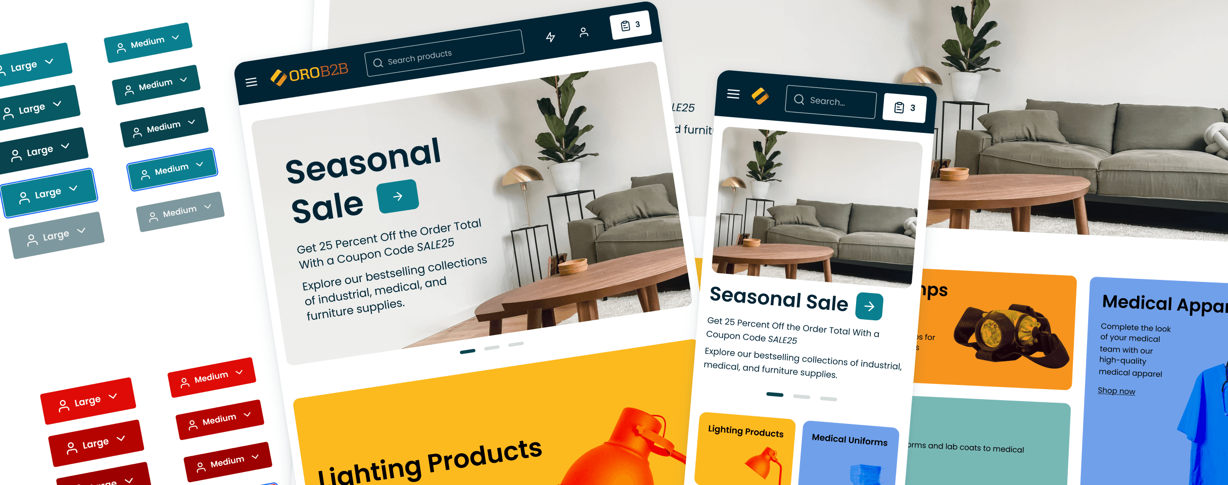
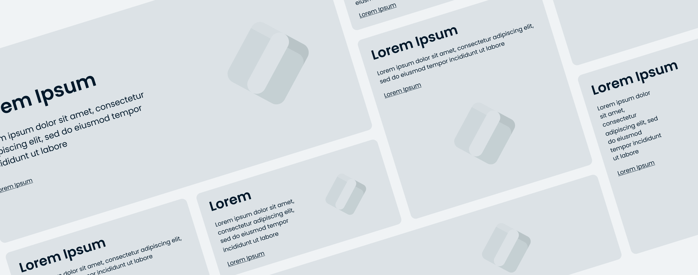
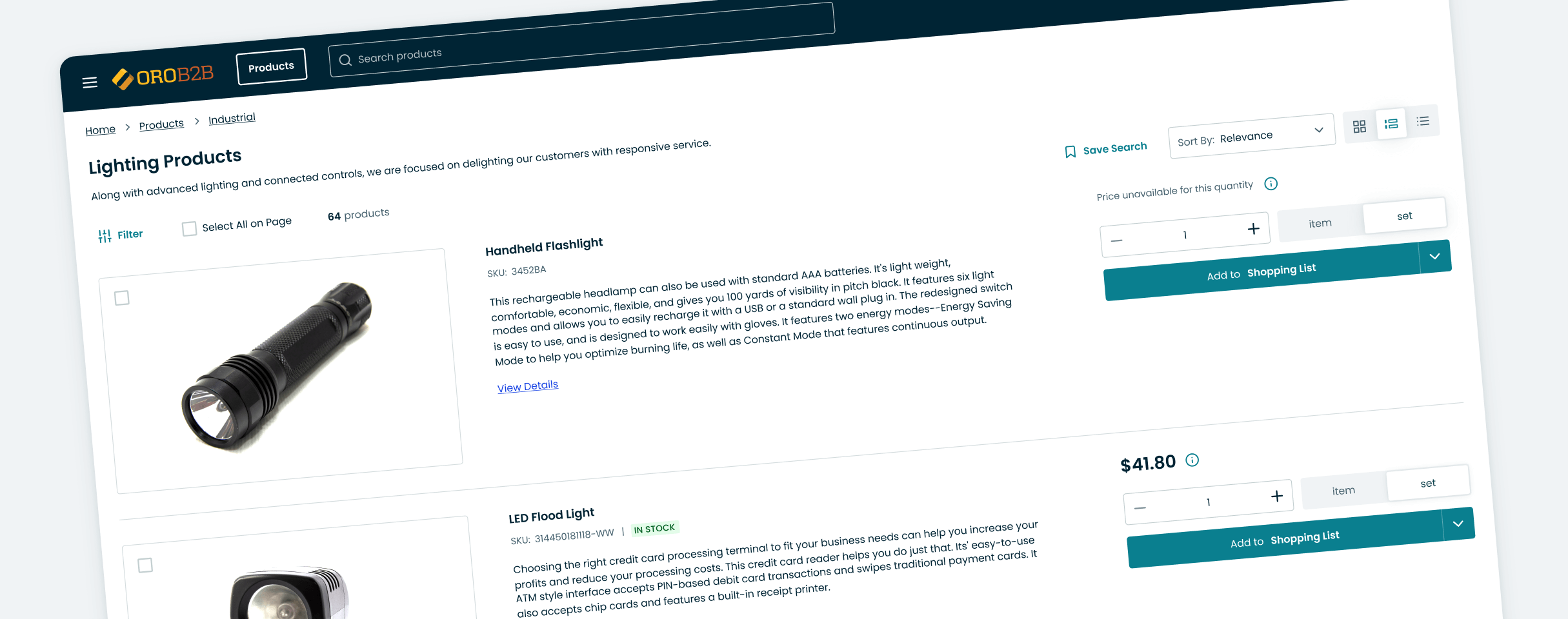
OroCommerce 7.0 LTS has introduced a new Intelligent Blue storefront theme in addition to the Golden Carbon and Refreshing Teal themes introduced in 6.1 and 6.0. The theme includes a fully editable homepage with configurable content templates and widgets, an improved and retina-optimized slider, product segment widgets and more. The theme has been designed to improve accessibility and internationalization, making navigation, search, and checkout experiences better, while also ensuring optimal performance.
We understand that every brand has its own unique corporate identity that sets it apart in the market. While OroCommerce offers options to customize the look and feel of the new themes in the back-office, we have compiled this style guide to assist you in customizing the current Intelligent Blue theme interface to align it with your corporate identity.
Download Figma Design Files
To help you create your custom Storefront theme design, we compiled two files, the Style Guide and Design Mockups. To access these files, you need a Figma account with a Professional, Organization, or Enterprise plan. This will allow you to connect the library file to your working design files.
Note
These Figma files use the new Intelligent Blue theme, which is the recommended and most actively maintained theme for OroCommerce version 7.0.
The Golden Carbon and Refreshing Teal themes are still available in version 7.0. To see how they look on the storefront, please refer to the related Figma files: Style Guide 6.1 (Golden Carbon), Design Mockups 6.1 (Golden Carbon) and Style Guide 6.0 (Refreshing Teal), Design Mockups 6.0 (Refreshing Teal).
This Style Guide contains:
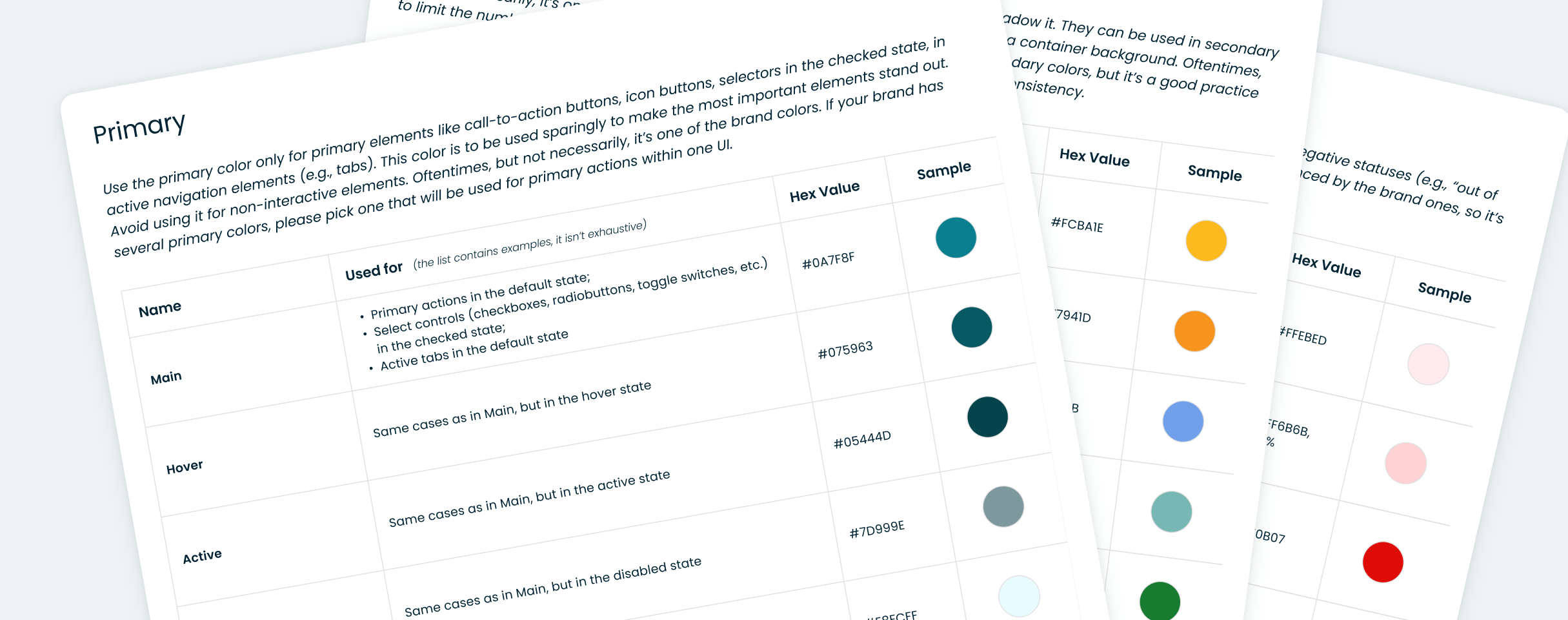
Styles with instructions on how to use them (colors, shadows and typography). You can change the styles to fit your company identity, publish library updates to your design work Figma file, and these styles will automatically be updated in every instance on every page that uses them.
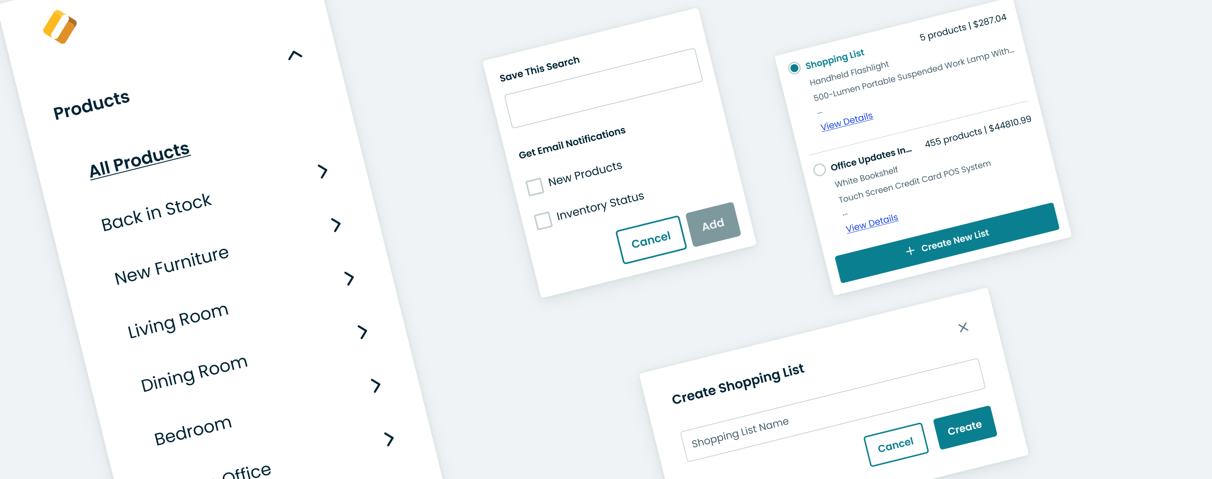
Ready-to-go UI components, from the simple ones (e.g., Feather Icons, buttons) to the compound ones (e.g., product cards) that are built with auto layouts and according to the atomic approach.
Design Mockups encompass all primary screens and page components, allowing for customizable design alterations.
Customize the Library
Once you have downloaded the Style Guide (Storefront Style Guide 7.0) and Design Mockups (Design Mockups 7.0) files, you can start customizing and use the provided Figma library:
Import the downloaded Figma files into your Figma project.
Note
Please remember that using a separate library file, which is our suggested approach, is only available if your team in Figma is on Professional, Organization or Enterprise plan.
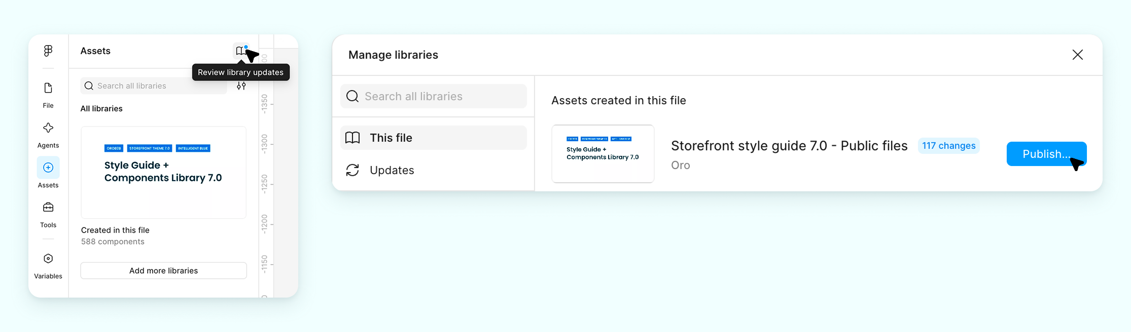
In the newly imported library file (Storefront Style Guide 7.0), open the Assets tab in the left panel and click on the book icon.
Find your newly imported library file name and click Publish; click Publish again in the window with styles.
When your library file is successfully published, make sure it does not contain styles or elements from any missing libraries. For this, open the Assets tab in the left panel and click on the book icon again. See if under the Libraries available in this file it says Includes 1 missing library. If it does, click the chevron right > with the Choose library dropdown to select your newly imported library file’s name and click Swap Library. The Swap default styles in instances option should be checked.
Open your newly imported work file (Design Mockups 7.0). In the Assets tab, click on the book icon. Under the Libraries available in this file find Includes 1 missing library (the source library which your Storefront Style Guide 7.0 file is an exact duplicate of), click the chevron right > with the Choose library dropdown to select your newly imported library file’s name and click Swap Library. The Swap default styles in instances should be checked. Swapping may take some time.
While still in your work file, open the Assets tab and click on the book icon again. Make sure your newly imported library is marked as Added, and that the file does not use elements or styles from any other libraries.
You can now customize the library styles and components.
For the development spec of a certain component, please use the Dev Mode.
Apply Changes
Once you have finished customizing the style guide and components library, please apply the changes to your work Figma file (the file with the design mockups) where this library has been added:
Open the Assets tab in the left panel of this file (library) and click on the book icon.
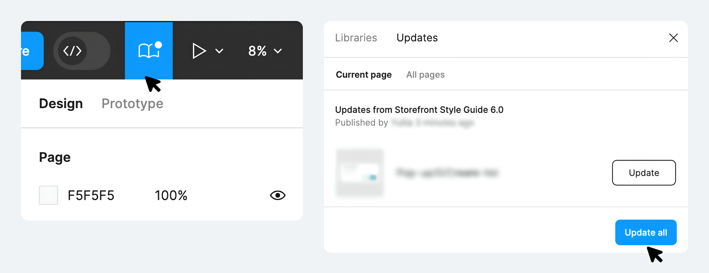
Find the current file (Storefront Style Guide 7.0), click Publish changes and then Publish.
Open your work Figma file. If this library is toggled on in your file, click Review unpublished changes (the book icon in the top right corner of the Figma toolbar) and then Update all.
For more in-depth customization of the theme design, such as changing element positions or page layouts, navigate through each page individually in your work file and make the changes there.
Recommended Figma Plugins
We have curated a list of plugins aimed at improving your workflow and productivity within the Figma platform.
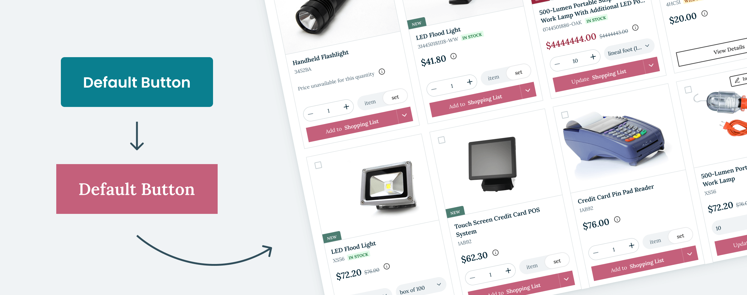
A11y - Color Contrast Checker — this plugin checks the color contrast ratio of all visible text in a frame, and it provides feedback on whether it meets WCAG’s AA and/or AAA level compliance. It also provides color sliders that allow users to adjust the colors and understand how the corresponding contrast ratio changes in real-time.
Batch Styler — batch change color styles (hue, saturation, lightness, alpha, hex), typography styles (font family, font weight, line height, letter spacing), batch delete or rename styles.
Design System Organizer — bulk swap instances and styles between masters with the same name. Copy styles between files. Manage pathnames like “toolbar/nav/back” using a folder-like interface.
Style Organizer — merge and link all color & text styles in the page:
overall usage assessment
group elements with the same appearance together
merge and link to the selected style
select all elements with the style
make all possible fixes automatically with a single click.
Instance Finder — find all Instances of a Component used in your file.
Max Line Length — a plugin that counts the maximum number of characters across all lines in a text box.
Select Layers — select layers by name, type or any property (hidden/parent/similar, etc.).
Iconify — import Material Design Icons, FontAwesome, Jam Icons, EmojiOne, Twitter Emoji and many other icons (more than 100 icon sets containing over 100,000 icons) to Figma document as vector shapes.
Content Reel — browse or search content to find published collections of text strings, images, and icons.
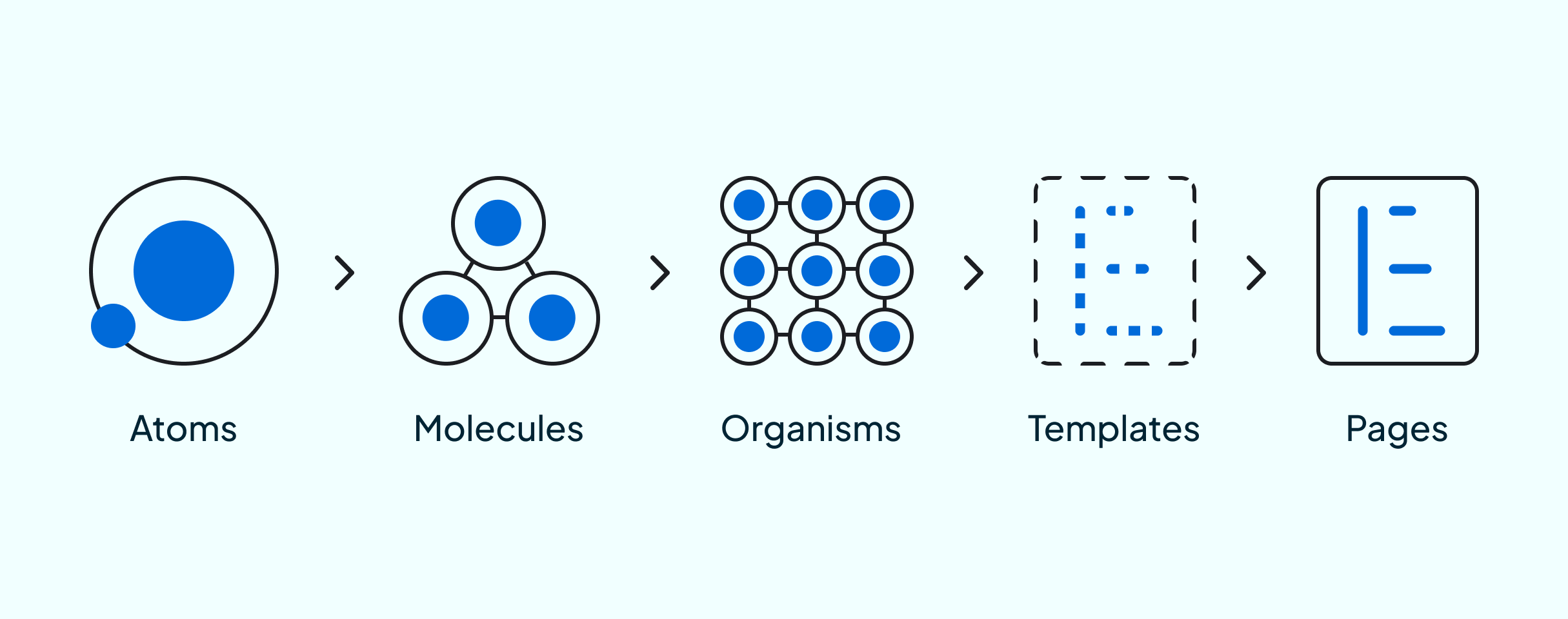
Atomic Design Approach
The structure of the OroCommerce UI is based on the Atomic Design approach, which means that all functional elements consist of:
Atoms - the smallest elements that cannot be separated and that serve as elementary blocks of the interface (colors, typography, buttons, icons, etc.)
Molecules - groups of atoms that form relatively simple functional interface elements (pop-up, button with dropdown, navigation menu)
Organisms - groups of molecules that form the relatively complex parts of the interface (header, footer, sidebar)
Templates - help place components in the layout and demonstrate the content structure underlying the design
Pages - help apply real content to templates displaying the final interface
Atoms
Atoms are fundamental building blocks of a user interface. They are comprised of basic HTML elements such as buttons, inputs, headers, etc. and cannot be separated without losing their functionality. Each atom has its own unique properties.
For instance, a button atom has properties such as background color, form, title color, size, and font. By modifying these properties, you can alter the overall style of the interface where the atom is utilized.
Atoms provide a foundation for all basic styles. Therefore, they can serve as a valuable reference material while designing and implementing a user interface in OroCommerce.
Molecules
Grouping atoms together forms molecules, which act as functional elements within an interface. For example, an input combined with two buttons becomes a form for editing the title of a shopping list. The input allows for the entry of a name, while the buttons provide options to accept or reject the form.
Utilizing molecules helps ensure the interface remains consistent and intuitive for users.
Organisms
Organisms are relatively complex components of a user interface. They consist of groups of molecules, atoms, or even other organisms. These organisms form distinct parts of the interface.
Taking the OroCommerce Storefront as an example, the header comprises various molecules and atoms, such as:
Login links and contact information (atoms)
Logo (atom)
Search field (a molecule that includes an input field atom and a search icon)
Navigation menu (a molecule made up of menu item atoms), etc.
An organism is a self-contained, isolated interface element that can function independently.
Templates
Templates are objects that define the layout of a page and provide a basic structure for the content. They show how components interact with each other and how the page should behave. Templates deal with the structure and logic of the page, covering all necessary UX cases where the actual content is not important.
Building on the previous example, the “header” component can be applied to the home page template.
Pages
Pages are templates that demonstrate how a user interface with actual content should appear. They represent the final stage of atomic design and showcase the version of the interface that is available to end-users. This is where you can see how all the individual components come together to form an attractive and functional user interface.
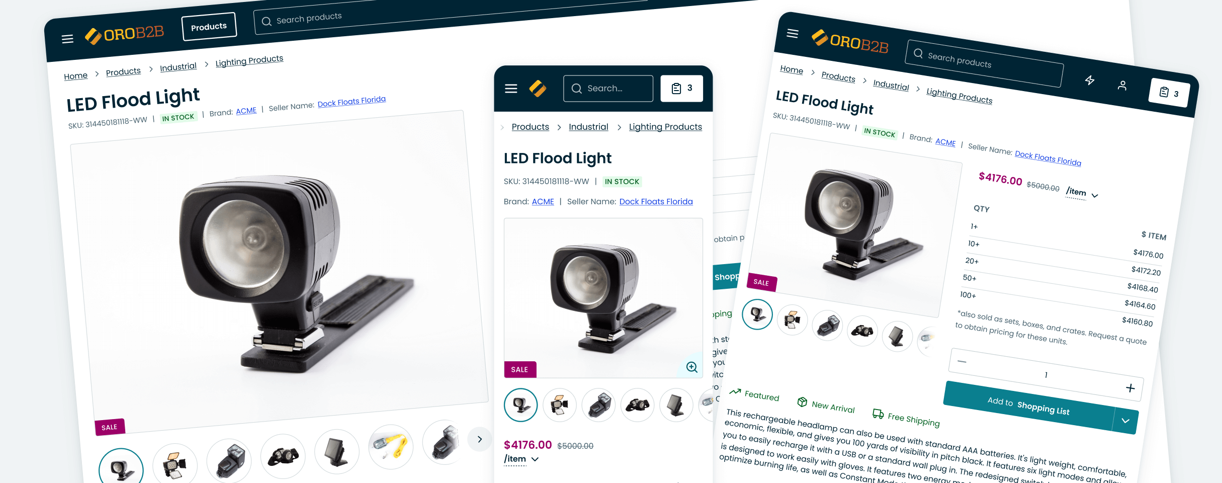
Responsive Approach
OroCommerce uses responsive web design, an approach that ensures web pages display correctly on various devices and screen sizes. To achieve usability and satisfaction, content, design, and performance must be consistent across all devices.
Breakpoints refer to the points at which the interface adjusts based on the display resolution. To successfully implement the theme design, designers must provide interface designs for the following horizontal resolutions:
360px - mobile device
768px - tablet
1280px - small desktop (optional)
1920px - large desktop
Business Tip
How can your manufacturing company prepare for digitalization in manufacturing? In our guide, we share business cases and best practices on succeeding in manufacturing digitization.