Important
You are browsing upcoming documentation for version 7.1 of OroCommerce, scheduled for release in 2027. Read the documentation for the latest LTS version to get up-to-date information.
See our Release Process documentation for more information on the currently supported and upcoming releases.
WYSIWYG Editor
The WYSIWYG editor feature is implemented by Oro applications to help you control the content of your HTML-like web pages within your website. It is an HTML page builder that helps you create a complex and attractive content with cutting-edge default and third-party widgets, embedded videos and pictures without any coding knowledge. Preview functions enable you to optimize the page for mobile and desktop formats before you publish.
The WYSIWYG editor integrates the GrapesJS framework out of the box. The framework provides multiple advanced capabilities for creating dynamic templates and HTML structures.
WYSIWYG Manager Blocks
The power of WYSIWYG is in its functionality that provides you with diversified tools to manage the content of the web pages within your website.
The main parts of the editor help define the interface and the structure of your templates and are responsible for different aspects of your work with WYSIWYG:
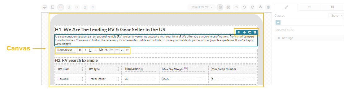
Canvas — A field with the appropriate HTML-like content to be displayed in the storefront. Within the canvas, you can move, copy, or delete the components, and format the text inside blocks.
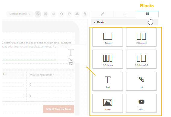
Blocks — A group of various blocks that you can drag and drop to your canvas shaping the desired content. A block can be either a text, a multi media file, a table or a column. You can also embed a piece of code, any default or third-party widgets, insert a link, a quote, or add a button. The basic set of blocks can cover most of your needs.
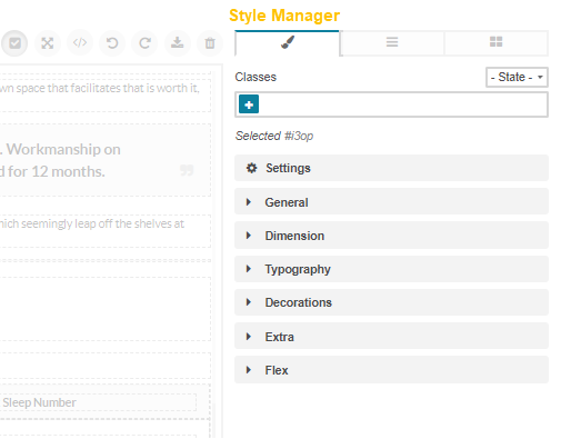
Style Manager — A group of settings that are used to customize the content blocks added to the canvas. Within the style manager, you can assign a selected CSS class to certain blocks, provided that the necessary class is specified in the file of css styles linked to the main website template. You can also set the alignment of the blocks against other content, set margins, paddings, fonts, and colors, scale and rotate the text, as well as apply other transformations to the selected content structure.
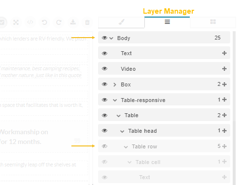
Layer Manager — A tree of used blocks structured in the order they are allocated on the canvas. To shift the order of certain blocks, click next to the selected block and drag it to the required place. You can also hide selected blocks, instead of deleting them, by clicking to the left of the block name.
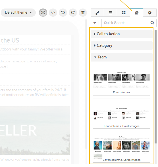
Content Templates — A list of content templates grouped by the tags assigned to them. Templates serve as pre-designed content blocks that you can drag to the canvas and modify their fonts, styles, etc. as the page requires.
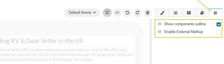
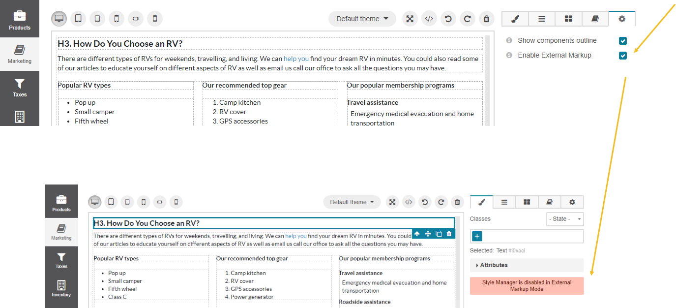
Settings — A group of settings that enable you to control the content outline and toggle the external markup mode. The external markup mode allows you to import a complex HTML code to the editor, preserving its formatting and styling.
WYSIWYG Functions
Hint
Keep in mind that, by default, the WYSIWYG editor enables users to insert only safe content. If a user cannot embed any content to the field, it may be because of content restrictions set in the configuration file. To change the restrictions, ask your developer’s assistance to follow the Post-Installation Configuration: Content Restrictions guide and override the default settings.
WYSIWYG enables you to do the following:
Add Formatting and Styles to Text Block
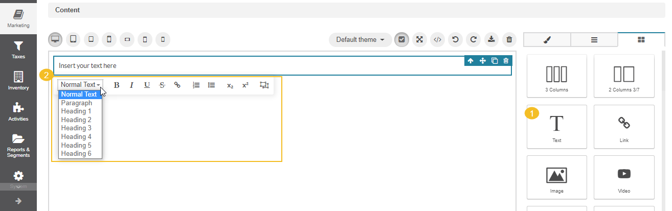
To add formatting such as bold, italic, and underlining to your text, you need to drag the Text Section block, enter the required text, and left-click the block to display the menu with additional formatting options.
Click the necessary option to (from left to right):
Apply the heading (H1, H2, normal text, etc) by selecting the required one from the drop-down list
Add bold formatting to your text
Add italic formatting to your text
Underline the text
Add a strikethrough effect on your text ()
Insert links to the text
Apply formatting and styles to the selected fragment
Create a numbered list
Create a bulleted list
Set your text below the standard line of type with the subscript icon
Set your text above the standard line of type with the superscript icon
Insert inline widgets
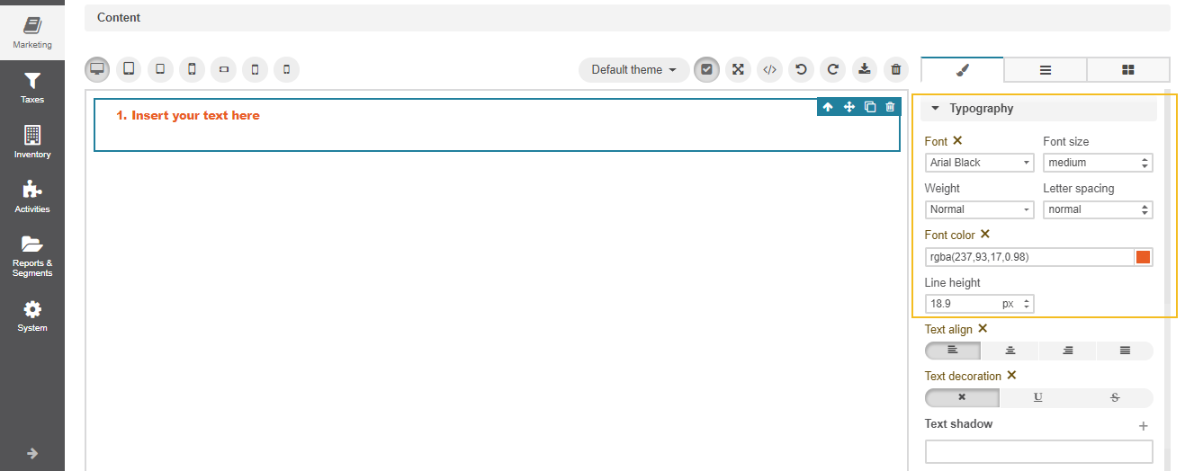
To apply different font faces, sizes, and colours to the whole text block, use the settings in the Typography section of the Style Manager Block.
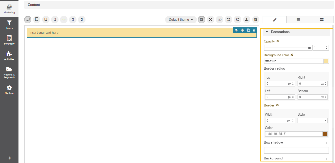
To set the opacity of the text block and add its background color, use the Decorations section of the Style Manager Block.
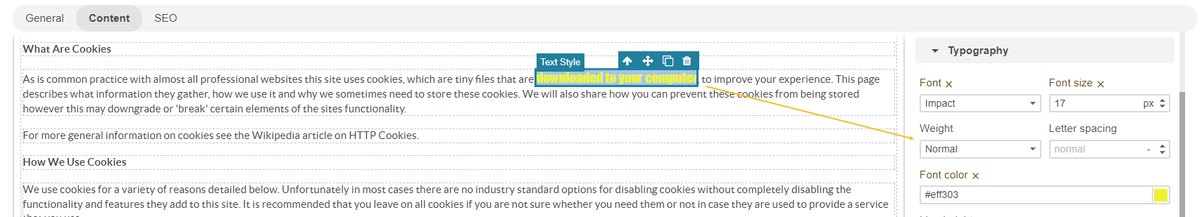
Add Formatting and Styles to a Text Fragment
To apply special formatting (italic, bold, font faces, sizes, colors) to a particular text fragment in the text block:
Select the fragment and click to wrap the text into the Text Style block. Use the
<span data-type="text-style"> </span>code if you import the text in HTML.
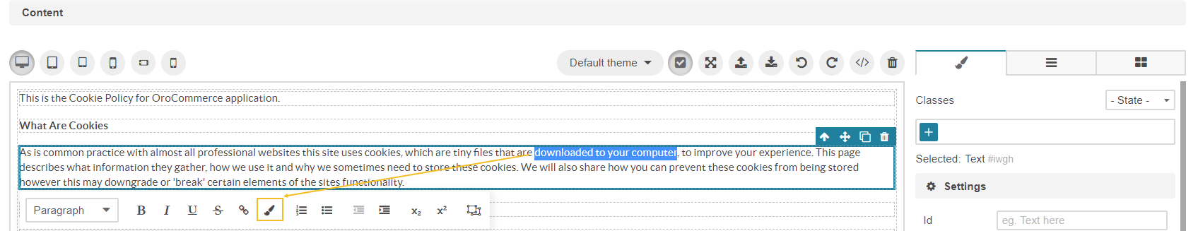
Click the block with the text fragment and start applying the required styles and formatting, separately from the other text in the block, through the Style Manager menu.
Shift the Text to a New Line
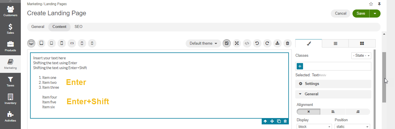
To move the text to a new line down, you can either press the Enter key or a combination of Shift+Enter. Both options shift the text to a new line without creating any gaps, paragraphs, or <div> between lines.
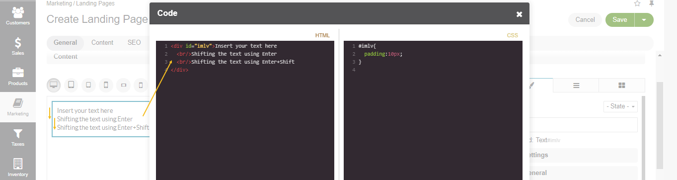
If you create a bulleted or numbered list, then press Enter to continue the flow or Shift+Enter to move a new line down without creating a new bullet or number.
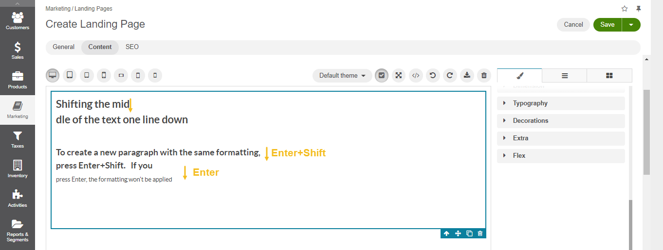
If H2, H3, or any other formatting is applied to the text, then you have several options to choose from:
If the cursor is in the middle of the text, then regardless of what you press, be it Enter or Shift+Enter, the remaining part after the cursor will be moved to a new line with the same formatting.
If the cursor is in the end of text, then pressing Shift+Enter, you move the text to a new line with the same formatting.
If the cursor is in the end of text, then pressing Enter, you create a new paragraph without any formatting applied to it.
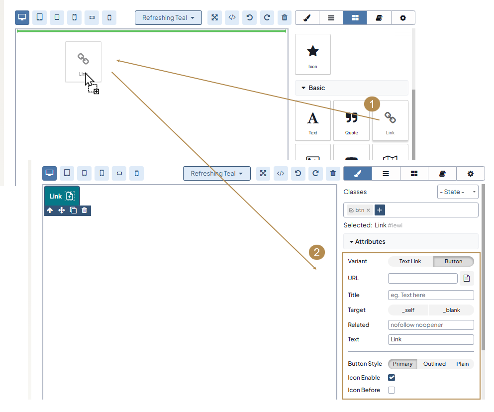
Insert a Button
To add a button to your content, do the following:
Insert the Link block to the canvas.
Navigate to Style Manager > Attributes.
For Variants, click Button.
Configure the button settings as needed:
Add the button URL, title, and other details.
Choose the button style: Primary, Outlined, or Plain.
Enable an icon if needed and select its position.
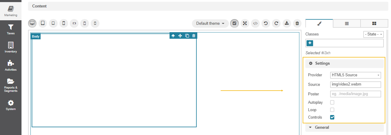
Insert Multimedia
To embed YouTube or Vimeo URLs to your content, you need to drag the Video block to the canvas. Set the video provider (HTML5 Source, vimeo) in the Settings section under Style Manager and add the direct link to the Source field. The permissions to add videos depend on the restrictions set in the configuration file.
Insert Multimedia Preserving the Required Aspect Ratio
There are some cases when a video on a mobile device or a responsive page does not fit the layout or appears with unrelated bars. To fix it, you need to configure the settings of such multimedia, image, or map, maintaining their correct scale and size.
There are several options to embed some multimedia into the WYSIWYG editor, preserving the required proportions (aspect ratios).
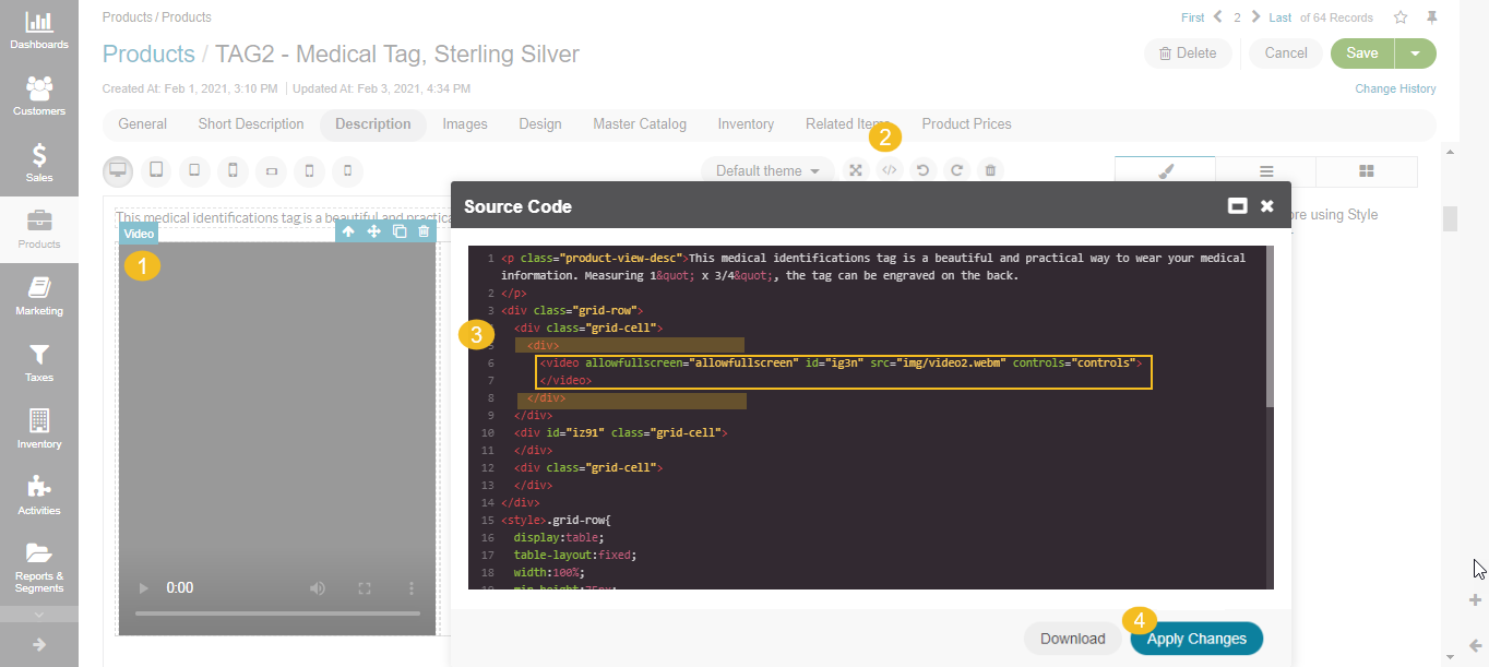
Option 1
Drag the video, image, or map block to the canvas.
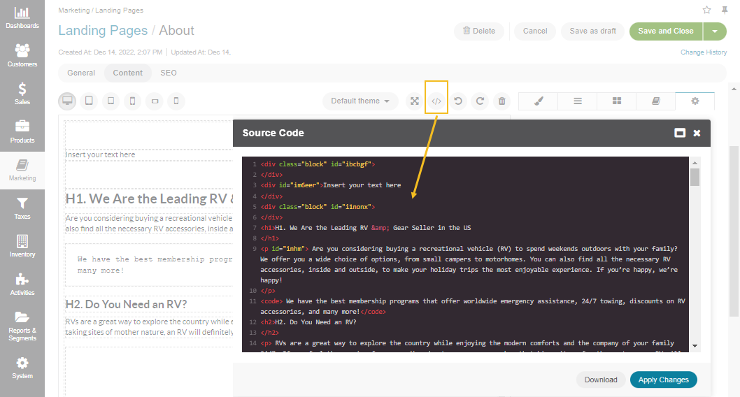
Click </> Source Code at the top menu above the canvas to open the HTML editor.
Find the video block and wrap it in a <div> container.
Save it by clicking Apply Changes in the popup bottom corner.
Click the wrapped file to open its settings and configure the following:
position: absolute;
top: 0;
left: 0;
width: 100%;
height: 100%
Click the file again and then click Select Parent to open the settings of its parent file.
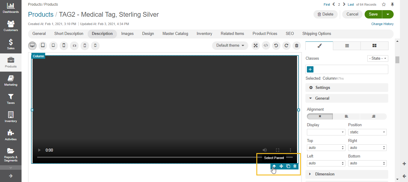
Configure the settings of the parent file as follows:
position: relative
padding-bottom: 56.52% (depending on the required scale)
Click Save.
Option 2
Drag the video, image, or map block to the canvas.
Click </> Source Code at the top menu above the canvas to open the HTML editor.
Find the video block and wrap it in a <div> container with the aspect-ratio class, as follows:
<div class="aspect-ratio"></div>
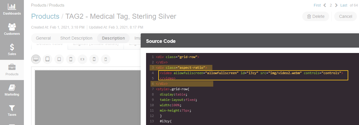
Add the following code to the <style> tag:
.aspect-ratio{
    overflow: hidden;
}
.aspect-ratio:before{
    content: '';
    width: 1px;
    height: 0;
    margin-left: -1px;
    padding-bottom: calc(9 / 16 * 100%);
    float: left;
}
Set the height and width parameters to your wrapped file:
width: 100%;
height: 100%;
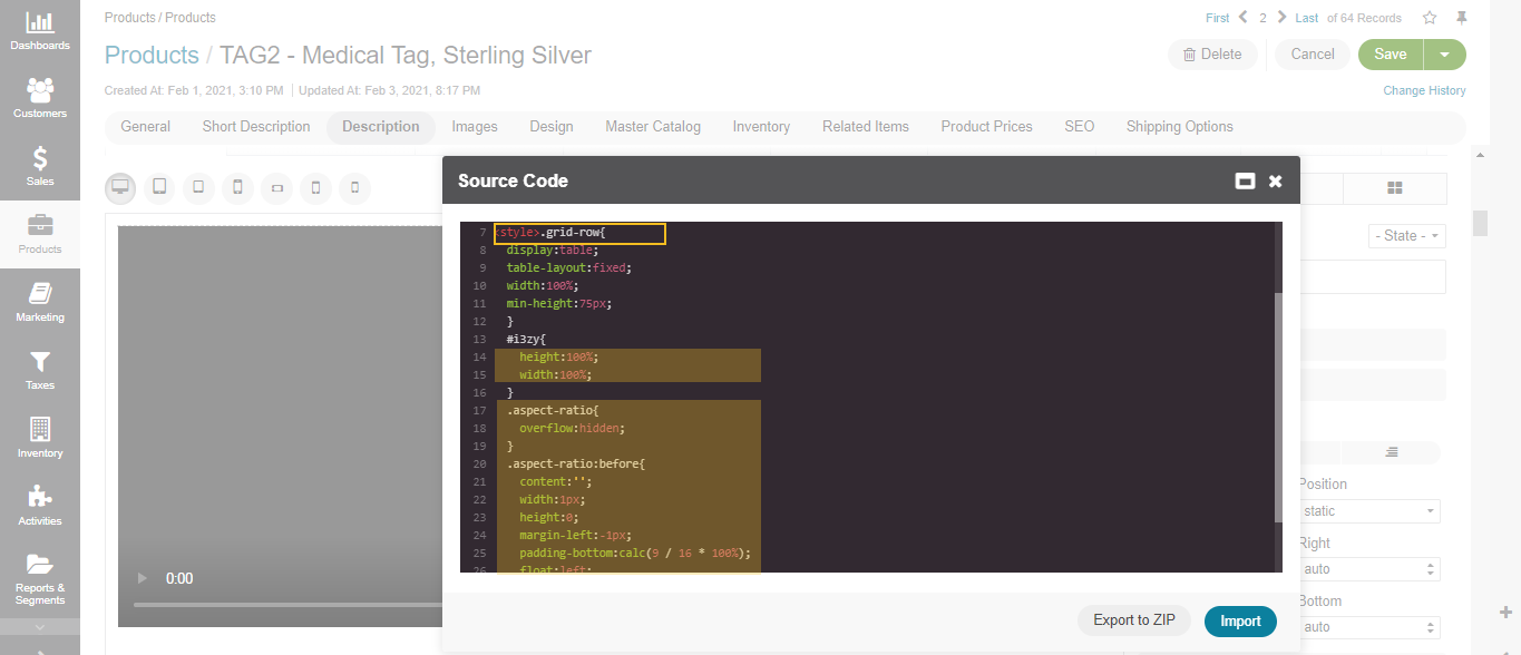
Click Apply Changes.
Click Save.
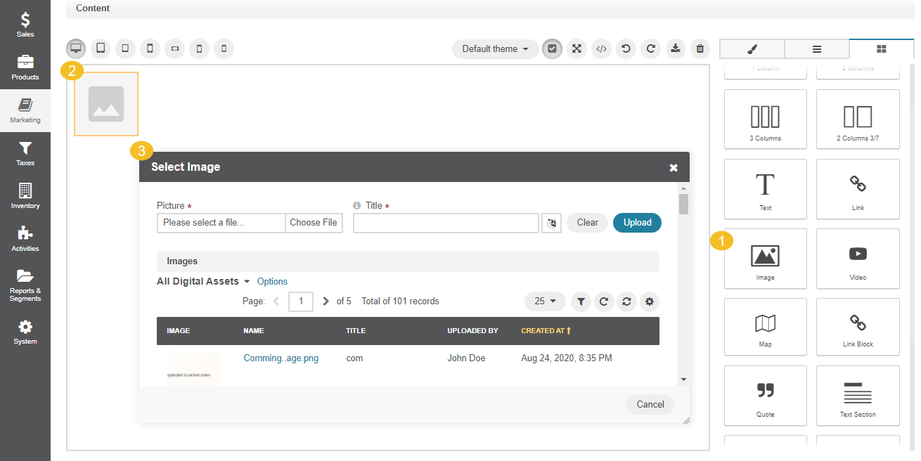
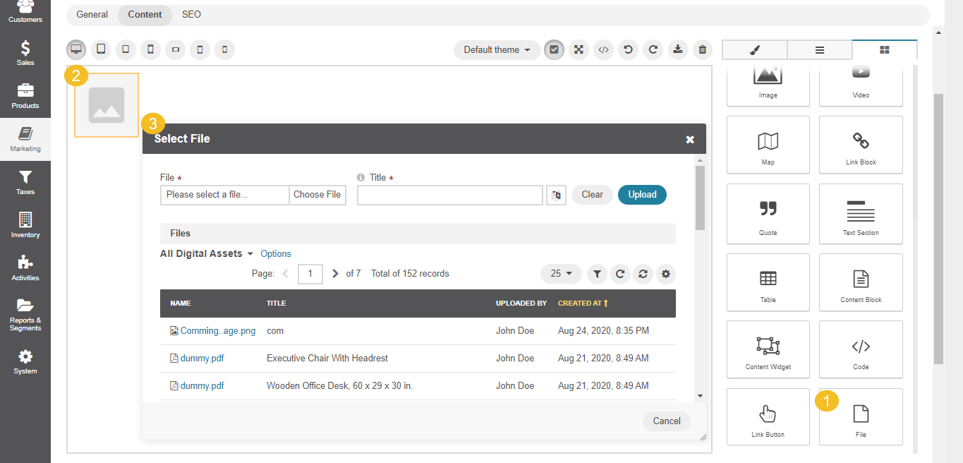
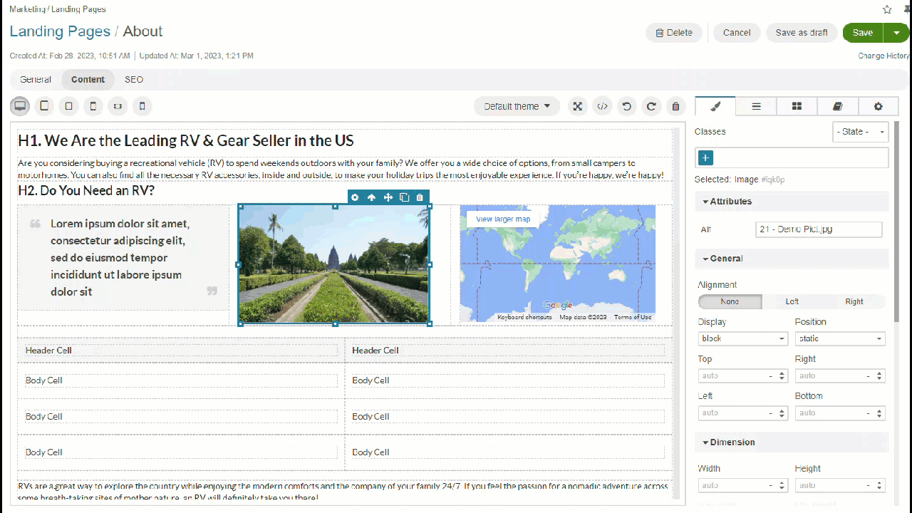
Insert Images
To insert an image to your content, you need to drag the image block to the canvas. Once you click the icon, it will navigate you to the file manager for you to select and add the required image from your local directory or from the list of available DA records.
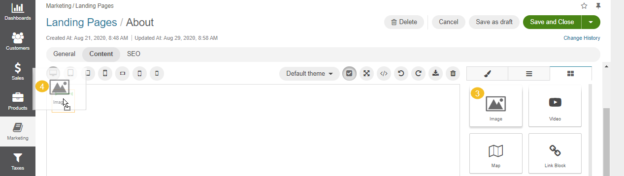
Insert Clickable Images
To add a clickable image to your content, do the following:
Insert the Link block to the canvas.
In the Style Manager section, enable the Allow Nested Content checkbox.
Insert the Image block inside the link block.
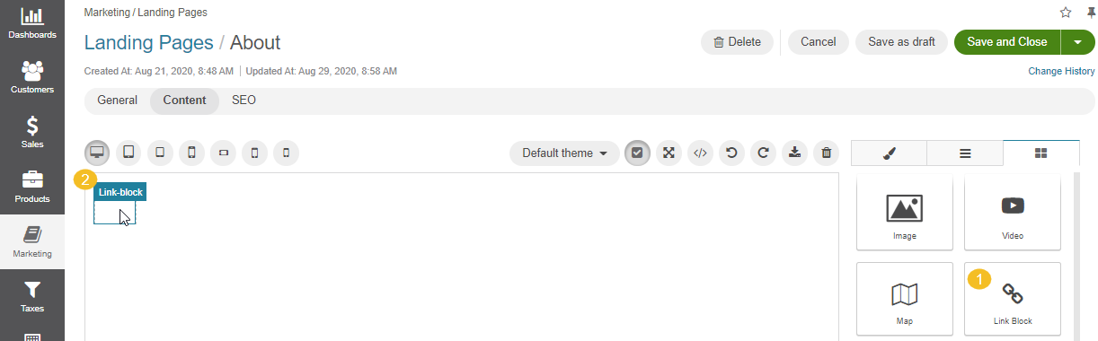
Move to the link block and open the Style Manager tab.
In the Attributes section, input the URL and title for the image to direct users to the necessary website, once they click the image in the storefront.
Insert Files
To insert a file to your content, you need to drag the file block to the canvas. Once you click the icon, it will navigate you to the file manager for you to select and add the required file from your local directory or from the list of available DA records.
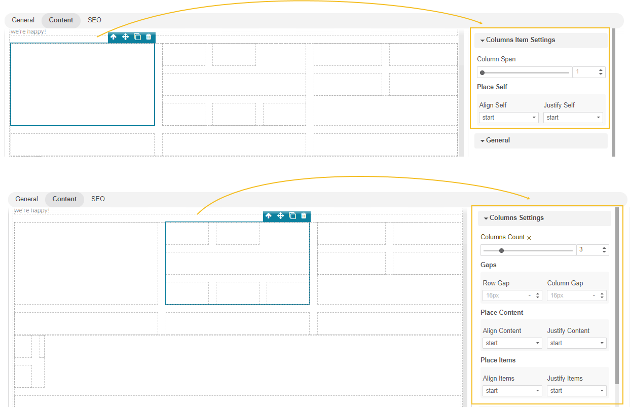
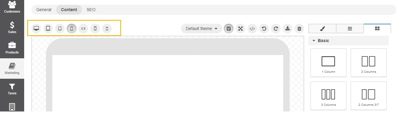
Add Columns
To add multiple columns to your content:
Drag the Columns block under the Layouts section to the required place on your canvas.
From the popup, select the required column number (1,2,3, or more). Columns are fully responsive and adapted to content, formatting, and styles that you apply afterwards.
You can place a column inside another column to extend the quantity of columns, like in the example below:
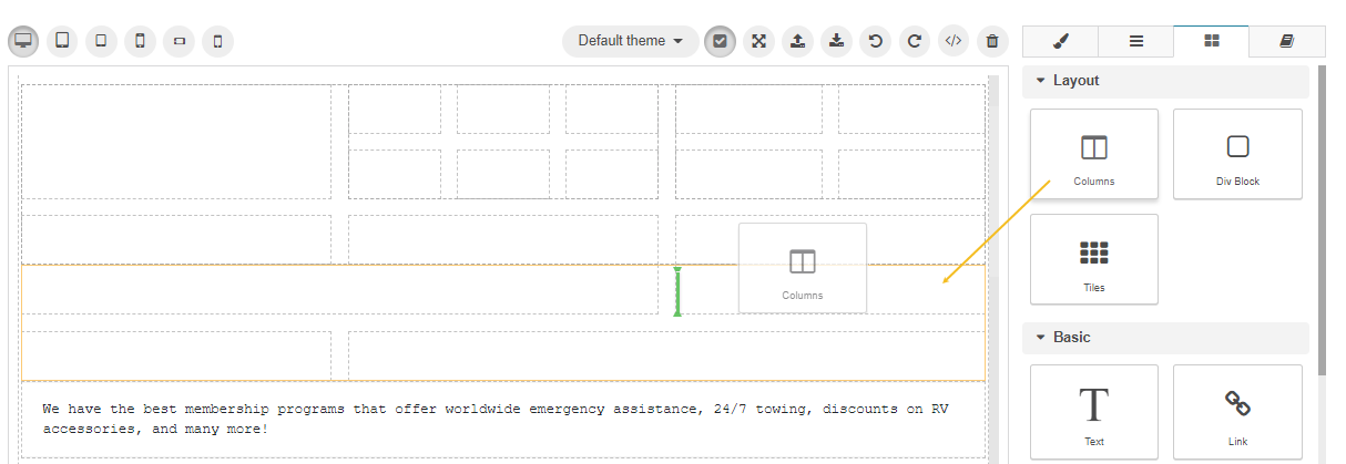
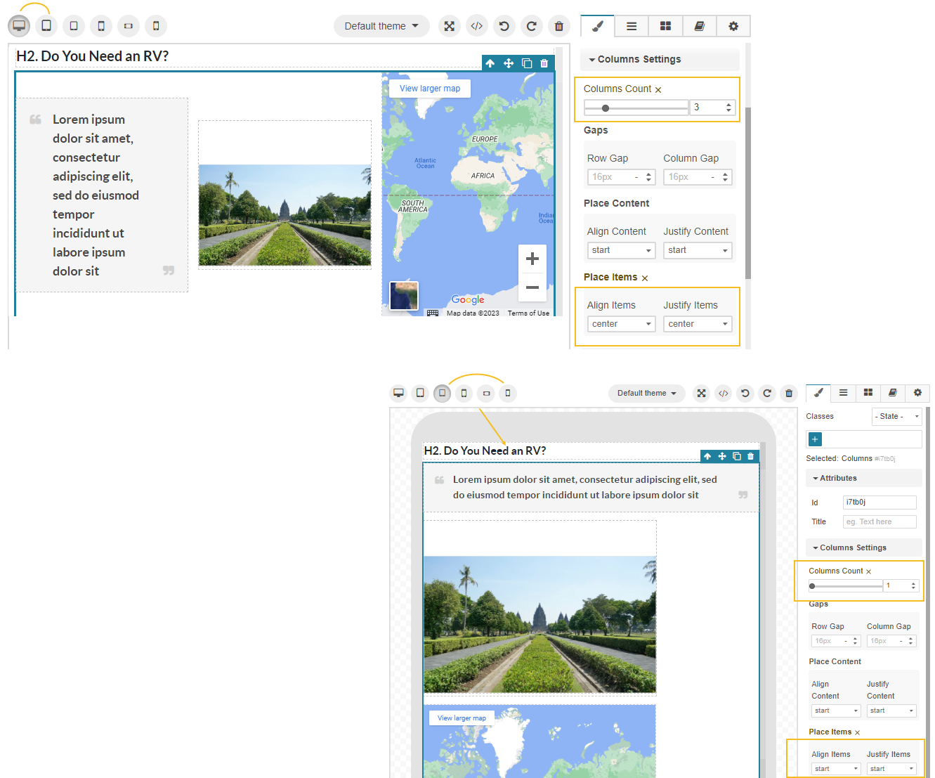
A new setting, Columns/Columns Item Settings, is added along under the Style Manager menu that enables you to adjust the number of columns, the gaps between them, and the column content alignment.
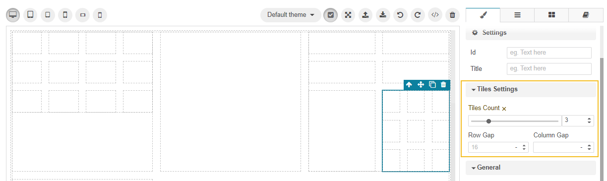
Add Tiles
Tiles enable you to display the records on the page as tiles (or bricks) instead of rows.
You can add standalone tiles of any size for text boxes, images, or other multimedia.
For that:
Drag the Tiles block under the Layouts section to the required place on your canvas.
From the popup, select the required tile template (1,2,3,1x3,2x3,3x3, or more). Tiles are fully responsive and adapted to content, formatting, and styles that you apply afterwards.
You can place a tile inside another tile to extend the quantity of tiles, like in the example below:
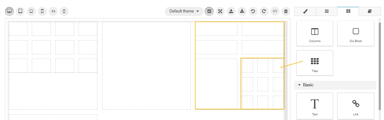
A new setting, Tiles Settings, is added along under the Style Manager menu that enables you to adjust the number of tiles and the gaps between them.
Add Div Blocks
To add a div block with a particular content element to your page:
Drag the Div block under the Layouts section to the required place on your canvas.
Insert the required Text, Image, or any other block inside the Div block to wrap the content element into the div container.
Add Icons
To add an icon to your page:
Drag the Icon block under the UI Components section to the required place on your canvas.
Select the required icon from the popup dialog. Use the search bar to locate the icon faster.
Configure the icon the way you require (adjust size, style, color, or replace the icon) under the Style Manager menu.
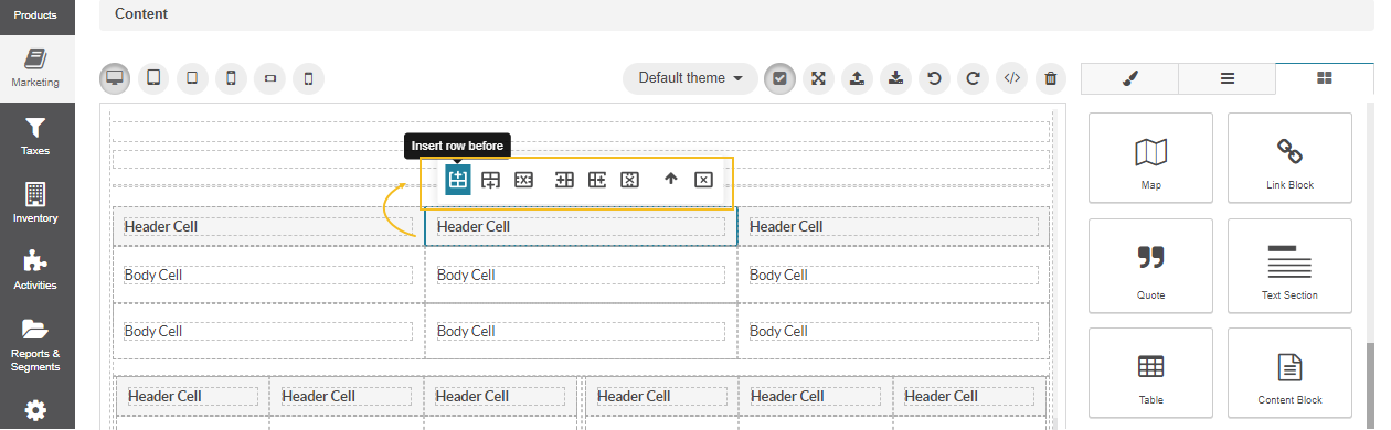
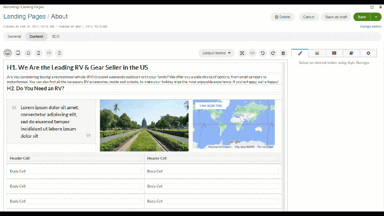
Add Tables
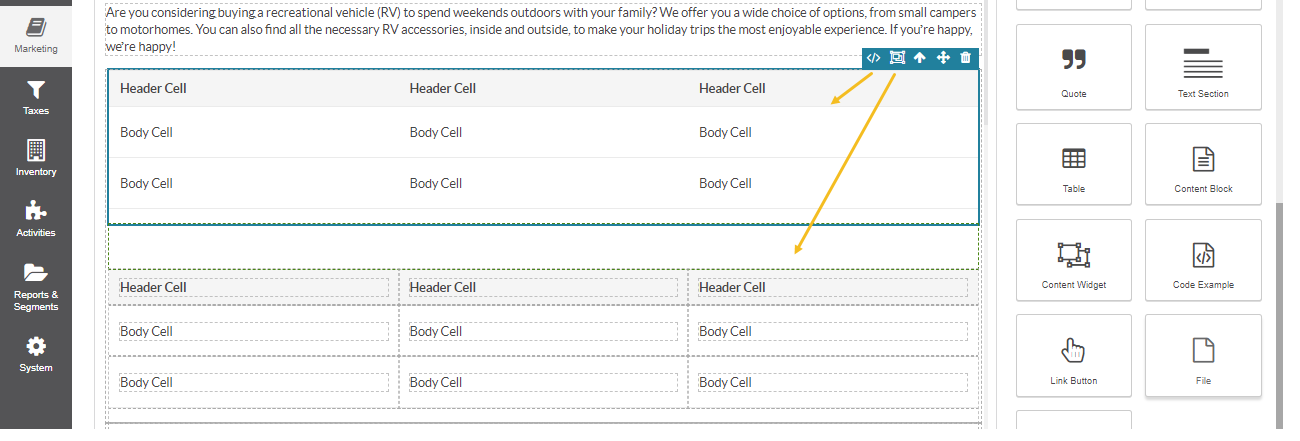
To add a table to your web page, you need to drag the table block to the canvas and place it to the required location. By default, the block inserts a 3x3 table. You can either delete the unnecessary column or add another column by cloning the required one.
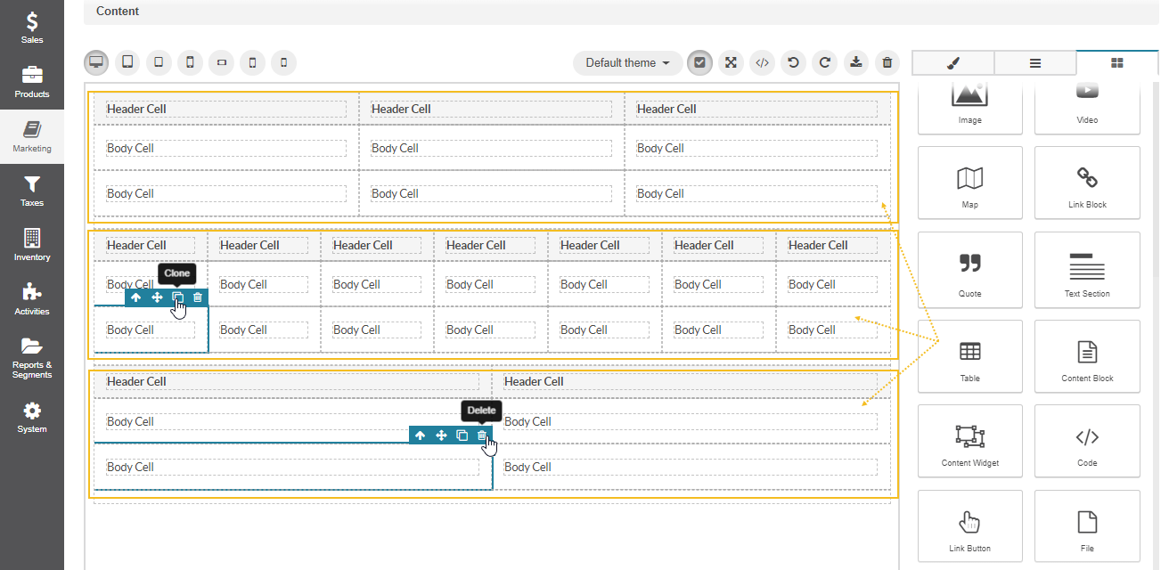
To insert/delete the rows and columns inside the table, click the required cell and select the action from the settings bar that appears next to the cell. Keep in mind that when a user adds the table markup (cell joints, complex tables) via the </> Source Code icon, the setting might be affected.
Insert Content Blocks
To add a content block to your web page, you need to drag the content block to your canvas and select the required one from the list of available content block that you have previously created and saved.
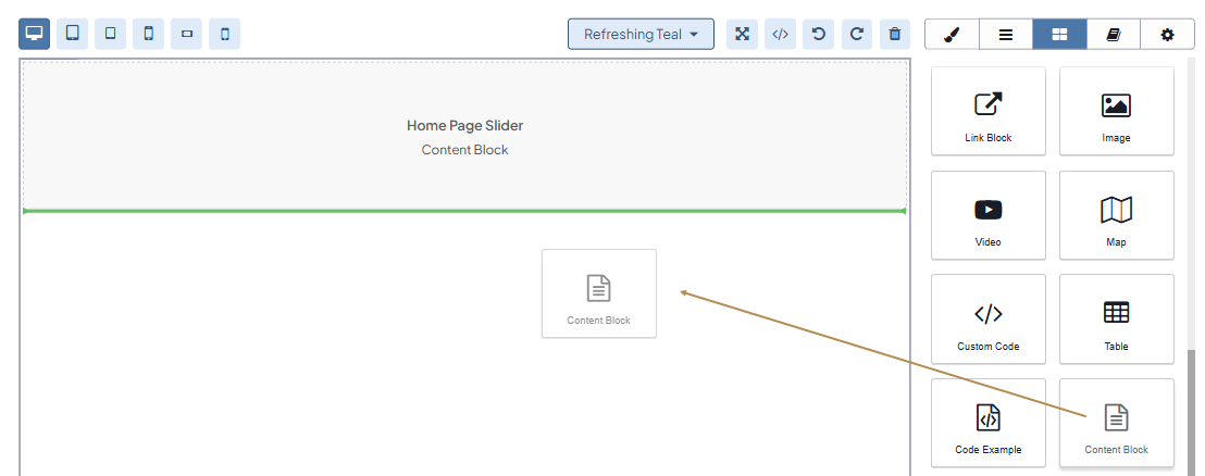
Once the landing page is added as a content variant to the content node of a web catalog, the content block should then become visible in the storefront.
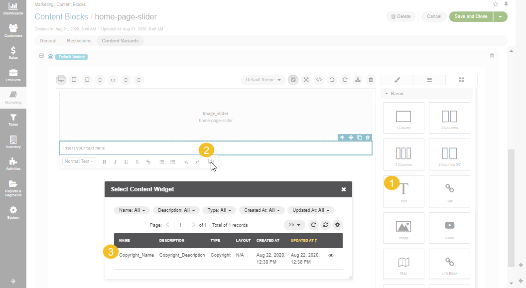
Insert Content Widgets
The widgets in OroCommerce come in two types, block widgets and inline widgets.
To add a block widget, you need to drag the content widget block to your canvas and select the required widget from the list of available widgets that you have previously created and saved.
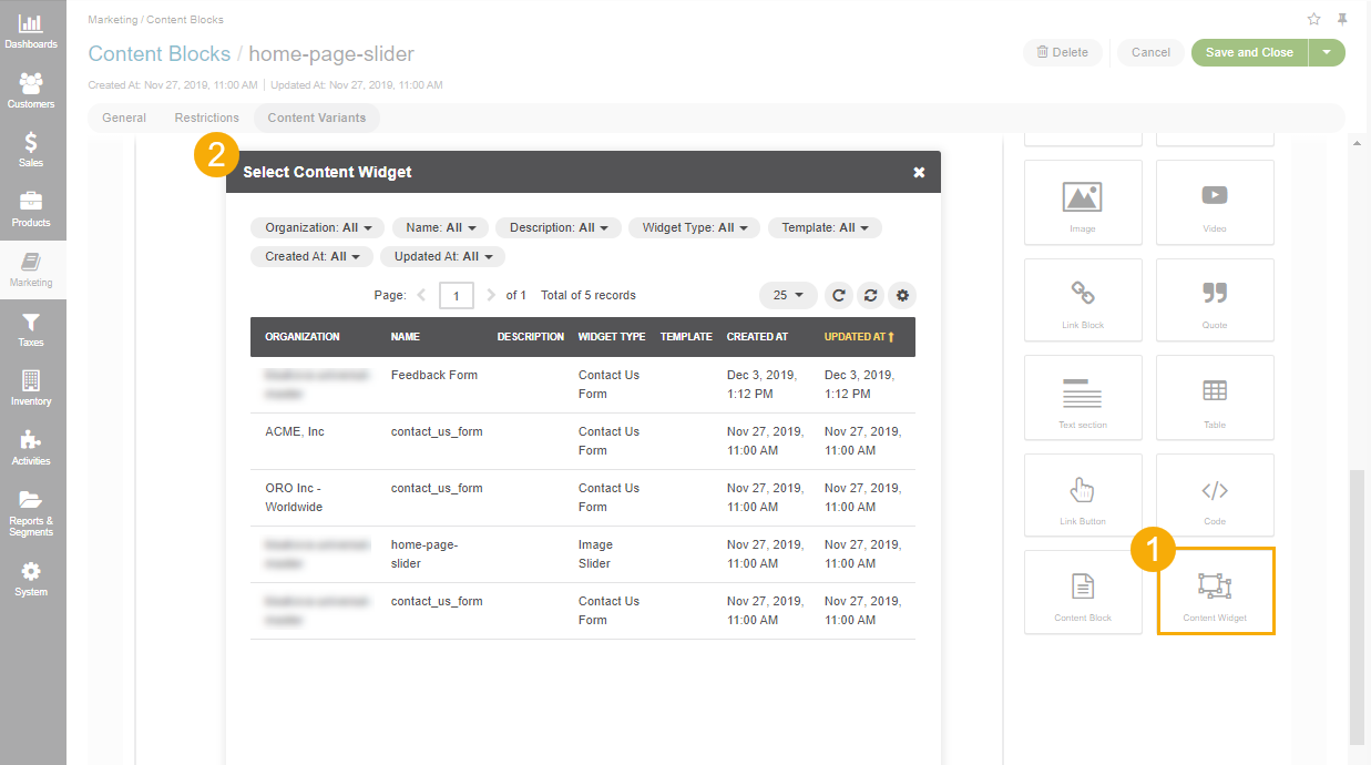
To add an inline widget, you need to add the text block, left-click it, and select the inline widget from the menu.
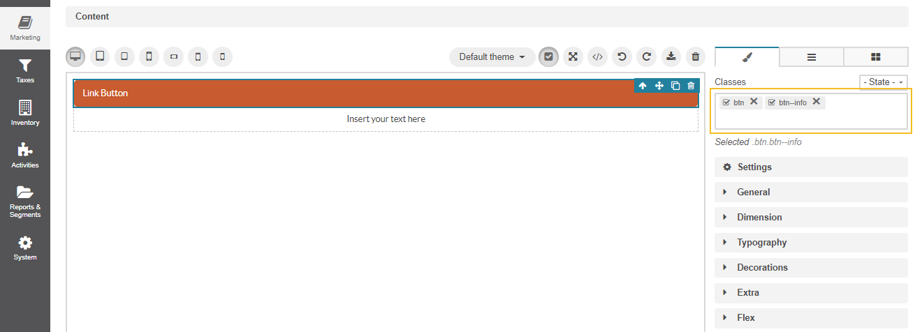
Apply Advanced Styling
To apply the existing CSS styles to an HTML element, you need to select the required block and enter the CSS style name in the Classes field under Style Manager. The style attribute with its defined properties and values is immediately assigned to the selected block. You can preview the changes directly in the WYSIWYG editor.
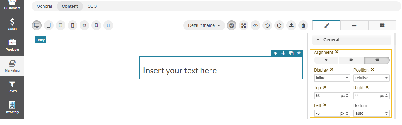
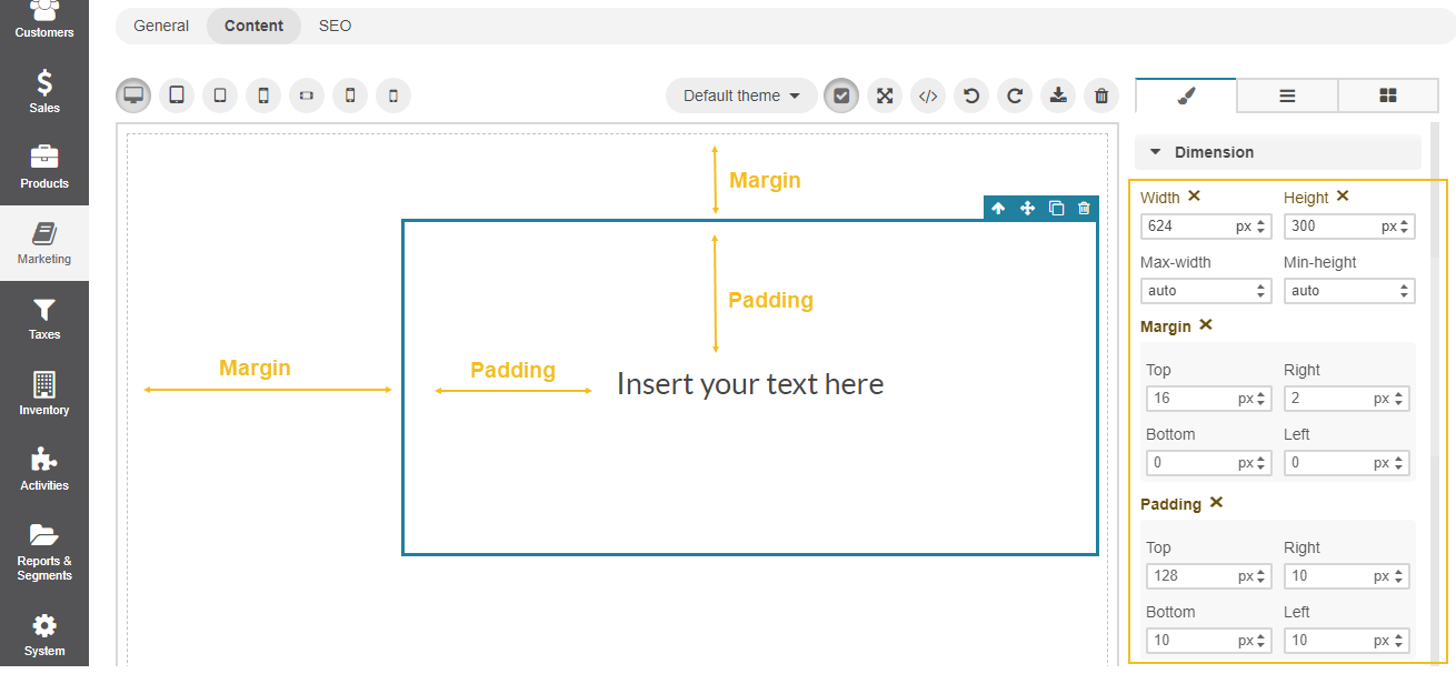
Align Blocks
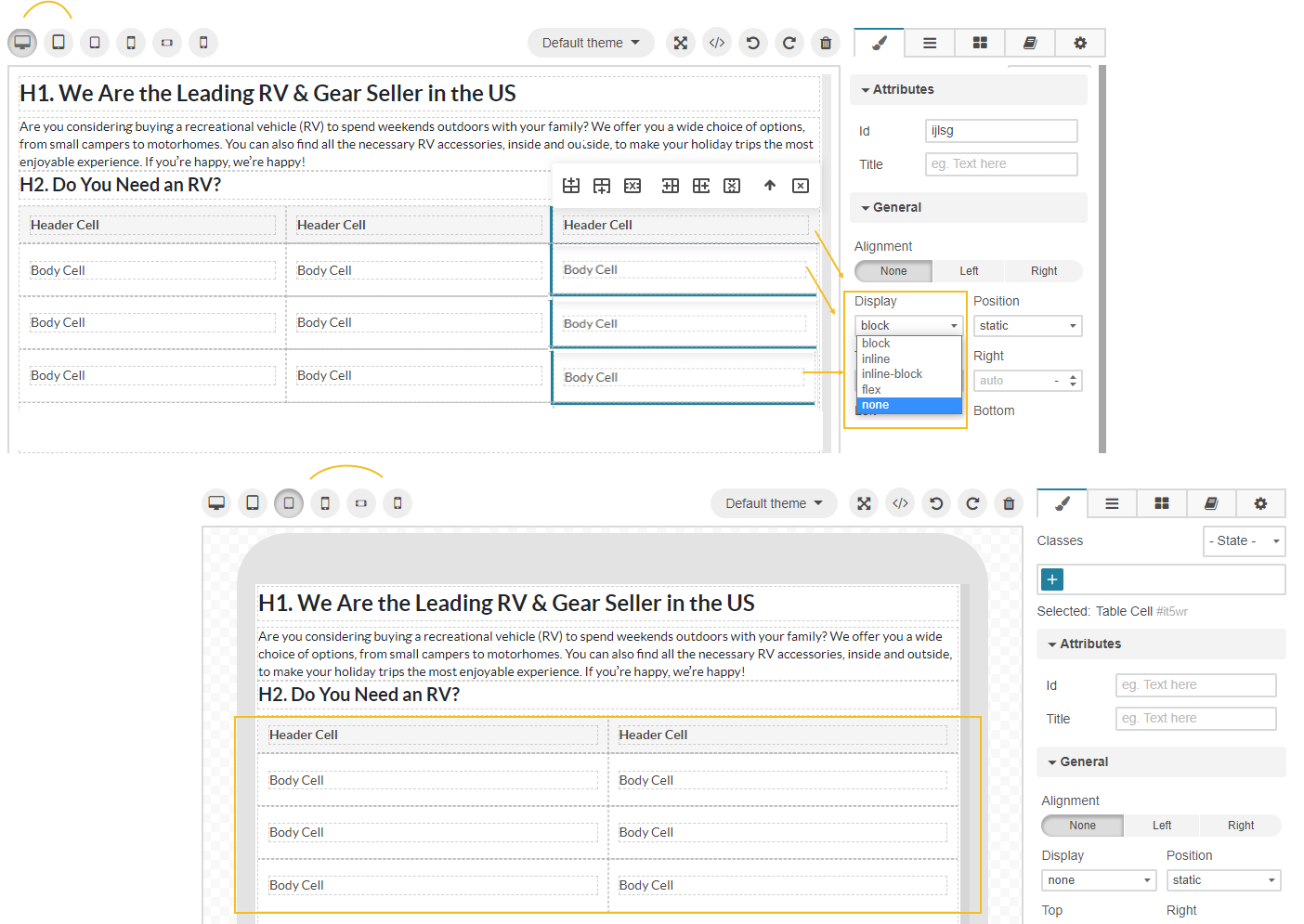
There are several ways to align the block to center, left, or right. For this, you need to click the block element to display the Style Manager menu settings and configure its options.
In the General section, select the required value in the Display and Position options. This allows you to relocate the block on the web page by changing the top, right, left, and bottom values.
In the Dimension section, set the following parameters:
width and height of the selected block
block margins — the space outside the content block, i.e., the area between the content block and the page edges
paddings — the space inside the content block, i.e, the area between the content block edges and the text inside
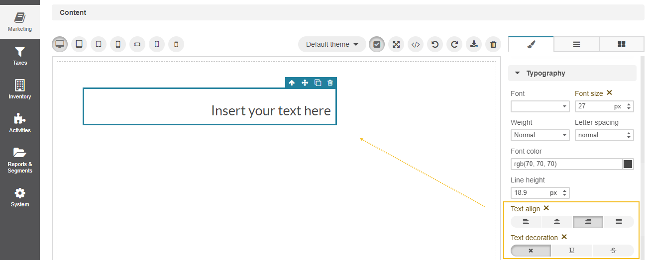
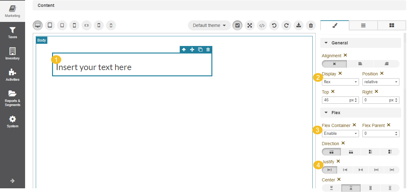
Align Content Inside Blocks
There are several ways to left-align, right-align, centre, or justify text, links, buttons, or any other content inside the block or column. For this, you need to click the block element to display the Style Manager menu settings and use one of the following options:
In the Typography section, select the required position for the text.
In the General section, select the Flex value for the Display option. Then, enable the flex container under the Flex section and align the text to the required position.
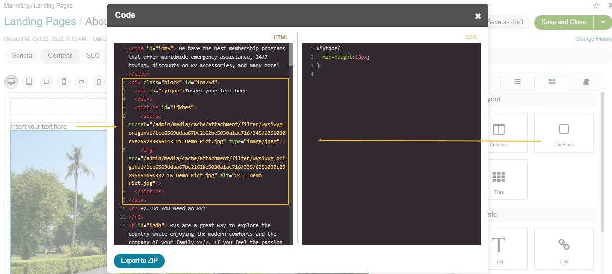
Input or Edit HTML Code
If you are experienced at HTML coding, you can enter your own HTML code into the WYSIWYG editor via the </> Source Code popup dialog. There, you can also edit the existing HTML code that was already applied to the canvas based on the created content.
Click Apply Changes to apply the changes made to the code.
Click Download to create an HTML page based on the provided HTML code and export it to a ZIP file.
Input an HTML Code Fragment
To insert a piece of HTML code anywhere on the web page:
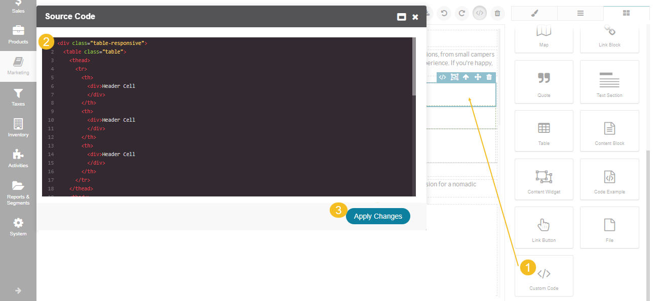
Drag the </> Custom Code block to the required place of your canvas.
Enter the desired HTML code.
Click Apply Changes.
If you are inserting a table, you can edit it in two ways:
through the HTML code dialog (</>);
by merging () the code into your web page content to adjust it via UI. Be aware that merging the table is an irreversible action that does not allow you to undo the merging. Refer to the Add a table section for more details on how to manage tables via UI.
Insert a Code Snippet
To insert a code snippet into your web page:
Drag the Code Example to your canvas.
Type the required text in the block.
The text appears formatted as code on your web page.
Disable the GrapeJs Style Manager
If you are importing a complex HTML code to the editor and want to preserve its styling, you can disable the WYSIWYG built-in style manager to prevent GrapeJs from breaking those styles.
For that, you need to enable the external markup mode to import the required HTML code as is, with its initial formatting and styling.
Navigate to the Settings menu.
Select the Enable External Markup checkbox. Keep in mind that you will not be able to apply and customize styles of your content. If you exit the external markup mode, the editor may change the source code and break the imported content markup and styles.
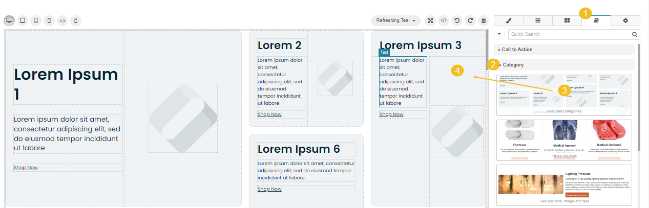
Add a Content Template
To add a content template to the canvas:
Open the Content Templates tab.
Expand the tags to preview the content templates and select the appropriate one from the list. Alternatively, use the Quick Search field and start typing the template’s name to speed up the search.
Drag the content template to the WYSIWYG canvas.
Start modifying the style of the elements by navigating from tab to tab of the WYSIWYG editor’s manager panel.
Tip
With the Featured Categories template, you can configure the properly styled tiled content, which is easily adapted to various screen breakpoints.
Adapt Content to Different Displays
WYSIWYG builder enables you to create a responsive HTML landing page adaptable to different breakpoints (screen sizes). If you are not satisfied with the content representation on a certain breakpoint, you can set the individual formatting of your content for this particular screen size, including different background colors, block dimensions, text alignment, and others. For this, select the display type and customize the settings appropriately. View the results dynamically by switching from one display to another.
The idea behind responsive content is that you have full control over different layouts of the same page. You can change images or hide content to make the page consistent for the target breakpoint. When a user lands on your website, they can see the appropriate view of the content based on their screen size.
Note
The changes made to a particular breakpoint are applied to all other breakpoints with a smaller resolution, while higher resolution screens remain unaffected.
There are several rules on how to adapt the content.
Adapt Text
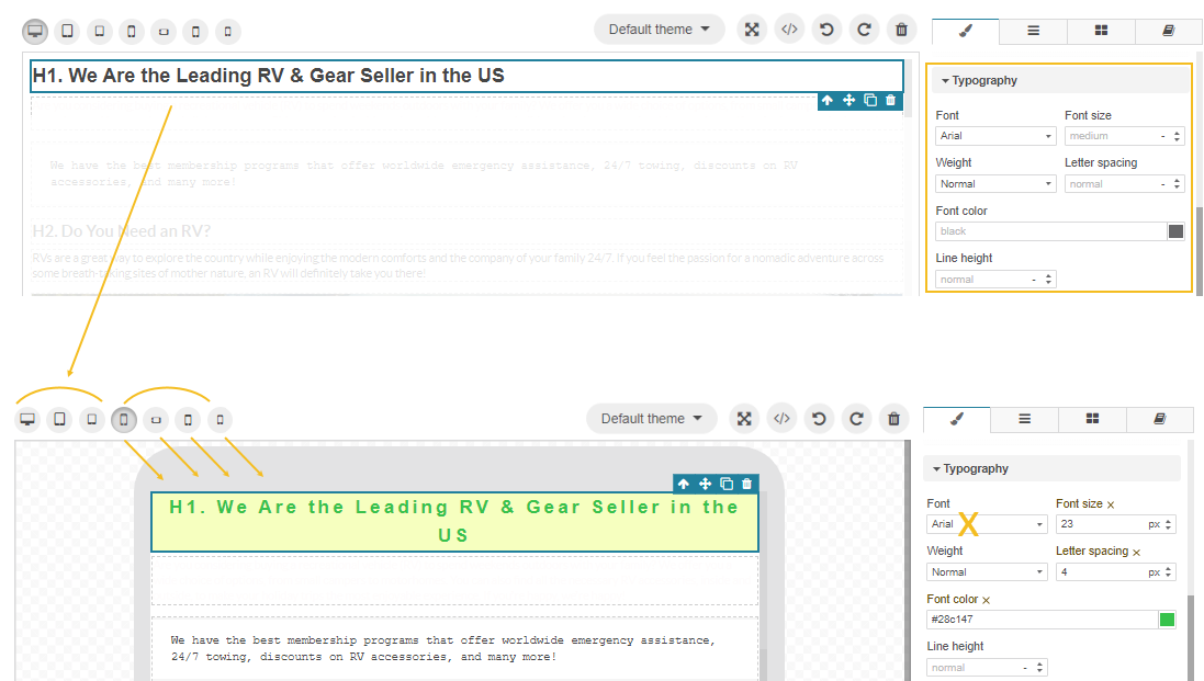
You can change the text alignment, font size, letter spacing, color of the text, and its background under the Typography and Decorations style manager menu of a particular screen size.
Adapt Tiles and Columns
To adjust the number of tiles and the gaps between them per screen size, click the Tiles block on your canvas, and configure the required settings under Tiles Settings.
To adjust the number of columns, the gaps between them, and the column content alignment per screen size, click the Columns block on your canvas and configure the required settings under Columns Settings.
Adapt Images
To increase or reduce the image size per breakpoint, drag the sizing handle or use the Dimension menu to set the required size and margins of the image.
To adjust the image positioning inside the block, use the General settings menu.
To set a different image per breakpoint:
Select a breakpoint.
Click the image to display its menu settings. Click to open the Picture Sources Manager menu to view all images per breakpoint.
Click Add Source.
Select the picture from the list of available DA records.
Select the breakpoint from Media Query. The field will be populated with the values default for the format. You can add as many formats as needed to display the picture properly on different screen sizes.
Drag the images to prioritize the ones with the lowest dimension.
Click Save.
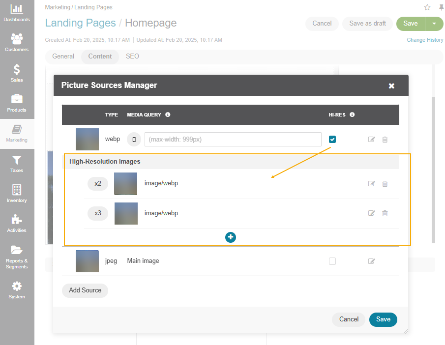
Adapt Image Resolution
To adapt an image resolution per breakpoint:
Choose the breakpoint where you want to upload a high-resolution image or adapt an existing image resolution.
Click the image to display its menu settings. Click to open the Picture Sources Manager menu to view all images assigned to different breakpoints.
Enable the HI-RES option for the selected breakpoint.
Once enabled, options for 2x, 3x, or 4x resolution images will appear.
Select the appropriate resolution and choose an image from the available DA records to ensure proper display across different screen sizes.
After adding the high-resolution image, click Save to apply the updates.
Hide Content
To hide a particular fragment of content:
Select a breakpoint.
Open the Layer Manager menu with a list of all available blocks for your canvas.
Click the block to hide (text, content, quote, image, div, table, etc.), except for the tiles and columns.
Alternatively, click the required block on your canvas to open the Style Manager menu. Make sure you select the highest parent block, otherwise the block may not be hidden fully, and may break the content view.
Open General > Display and select the none option to hide the block.
Hide Columns and Tiles
To hide a particular block of columns or tiles, you need to wrap it into the div container. Columns and tiles have a complicated structure, which can break the view if you take a puzzle out of the set, so it is possible to hide only the entire block, not a single object. To prevent WYSIWYG from breaking the formatting and styles of columns and tiles, you need to add a Div block to your layout and paste the block of tiles or columns inside it.
For that:
Select a breakpoint.
Open the Blocks menu and drag the DIV Block from the menu to your canvas next to the block you want to hide.
Click the block of tiles or columns. Make sure you select the highest parent block, otherwise the block may not be hidden fully, and may break the content view.
Move the block of tiles or columns inside the Div block.
Once the tiles or columns are wrapped into the div container, you can manage them similarly to any other content block.
Open General > Display and select the none option to hide the block.
The changes are applied to all screens with a smaller resolution, while higher resolution screens remain unaffected.
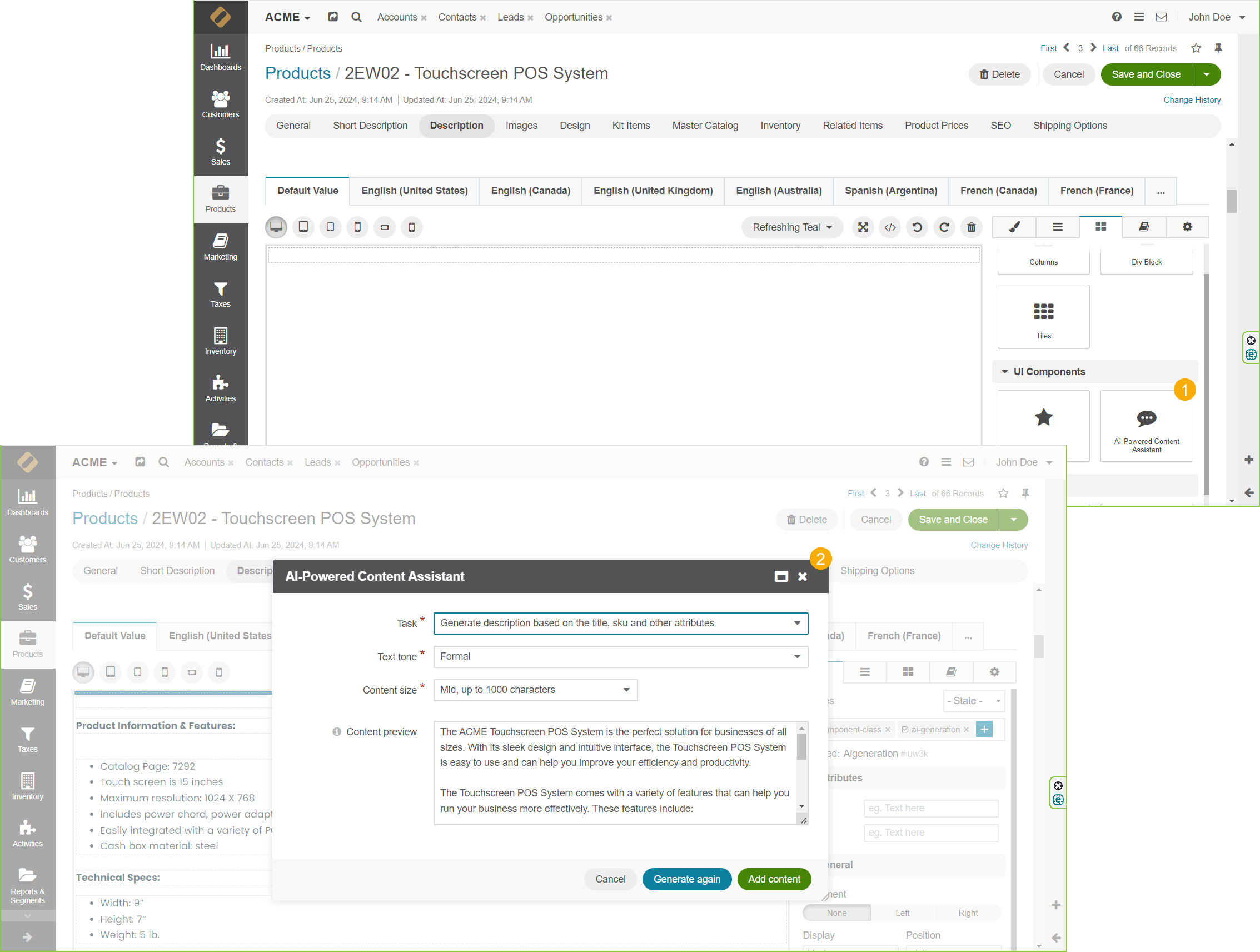
Generate Content Using AI
When OroCommerce is integrated with AI clients such as OpenAI or Vertex AI, you can use an AI-Powered Content Assistant widget in the WYSIWYG editor to generate content for product descriptions, landing pages, content blocks, master catalog categories, and emails.
To use the AI widget, drag it to your canvas into a text field. Depending on which AI client you are integrated with and where in the application you use the AI widget, there may be various options available. Typically, you can select a number of tasks to perform, add features and keywords to base content and specify the tone for the generated text. For example:
Task |
|
Text Tone |
formal, casual, instructive, persuasive, humorous, professional, emotional, sarcastic, narrative, analytical, descriptive, informative, optimistic, cautious,reassuring, educational, dramatic, poetic, satirical |
Once you select the task and tone, click Generate. If you are happy with the generated text, click Add Content. You can also modify the given text manually or click Generate again.
For more information on the available AI integration options, see Configure AI Integrations in the Back-Office.
Related Topics