Manage Common Controls in the Storefront
Tables (Grids)
Views in the form of tables can be considered the most commonly used UI elements in Oro applications. They are interactive, as they not only display data about specific store records but contain links to these records’ pages. Views are also configurable – so you can adjust the appearance and contents of the tables to your taste and needs.
Such tables represent aggregated views of data and store records, making it easy to locate and manage records, with every grid page functionally tailored to the type of information it represents.
Breadcrumbs
Breadcrumbs displayed under the top navigation bar show the hierarchical path to the current page, based on the product catalog structure.
The current page is not included in the breadcrumbs on all pages.
Breadcrumbs that contain only one item are not shown.
Display Options
Views
When browsing the website, buyers have the flexibility to choose how they view content, with three distinct options available: gallery view  , list view
  , or compact view
  .
.
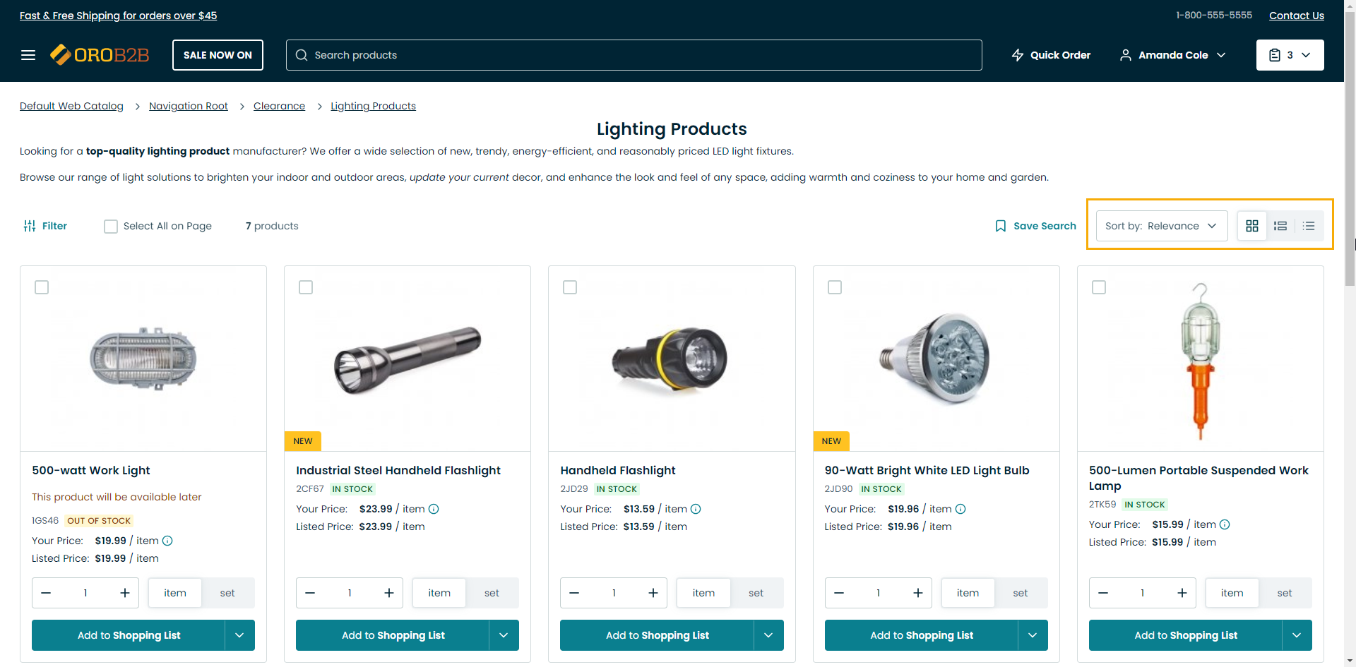
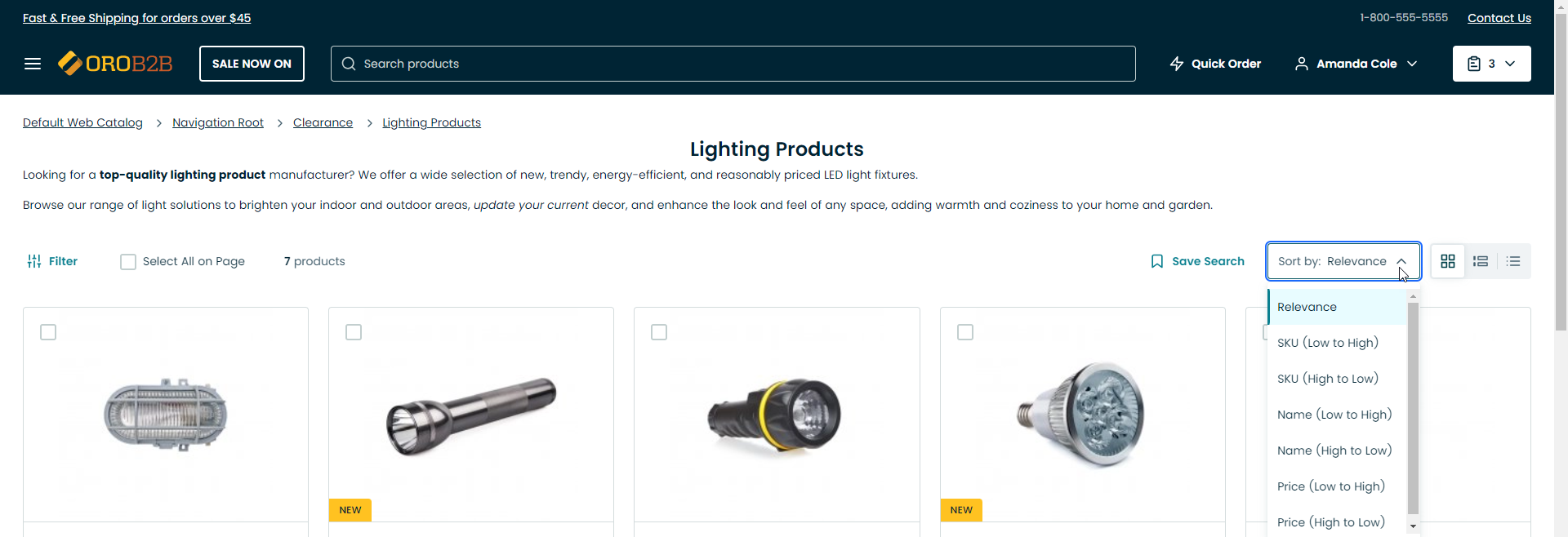
Sorting
Buyers can sort records alphabetically, by price, relevance, or other attributes related to the products displayed on the page you are viewing.
Page Navigation
If you have many records, they all may not fit on one data page. In this case, use the pager block in the center above the view table.
In the pager block, you can see the page that you are currently on, the total number of data pages and the total number of records in the view table.
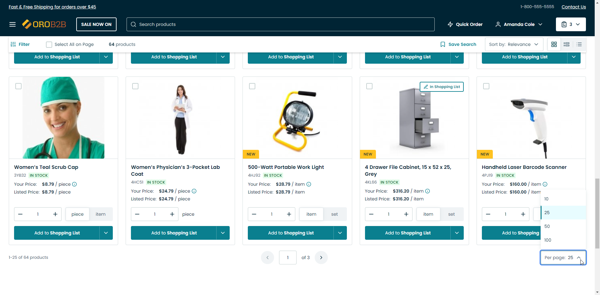
You can navigate between pages using the < Prev and > Next page buttons. To open a particular page, type its number in the field that displays the current page and press Enter.
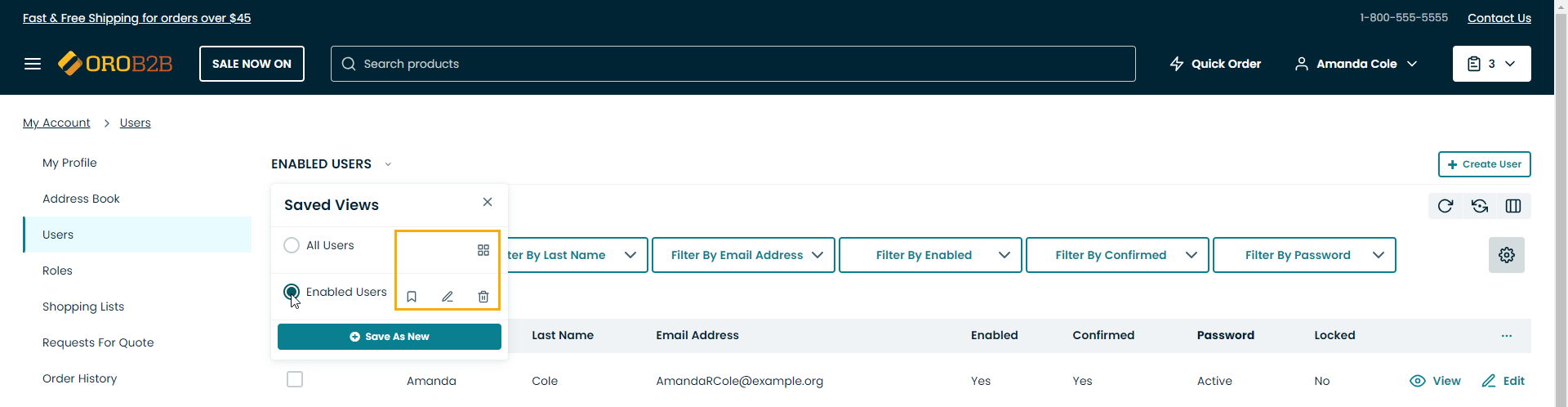
Saved Views
A saved view is a table with applied filters or custom orders.
The default table view is what you see when you open a view page, it shows unfiltered data.
Tables can be viewed, saved as new ones, shared, renamed, set as default and deleted:
To view the list of available tables: click on the
 arrow next to the table name.
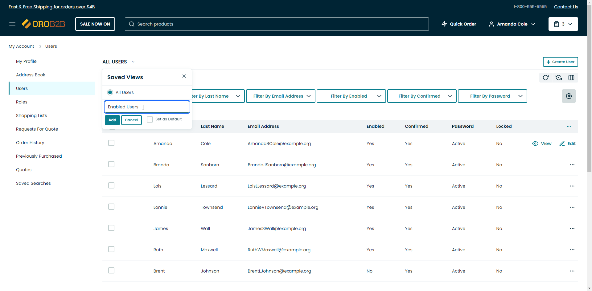
To save a table as a new one: click Save as New.
Enter New List Name: Define a name of the new view table.
Set as Default: Select this checkbox to set the new table as the default one.
Add: Click Add to add a new saved view table.
Cancel: Click Cancel to exit.
The following actions are available for saved view:
share the selected saved view:

unshare the selected saved view:

set the selected saved view as default:
rename the selected saved view:

delete the selected saved view:

Action Buttons
Action buttons are on the right of the view page. They enable you to perform a number of actions with records. The set of such buttons varies depending on the type of the view opened.
The following action buttons can be available:
Refresh the view table: click
 to update the view table.
Reset the view table: click
 to clear view table customization and return to default settings. Reset applies to all filters, records per page and sorting changes that you have made.
Table settings: click
 to define which columns to show in the table:
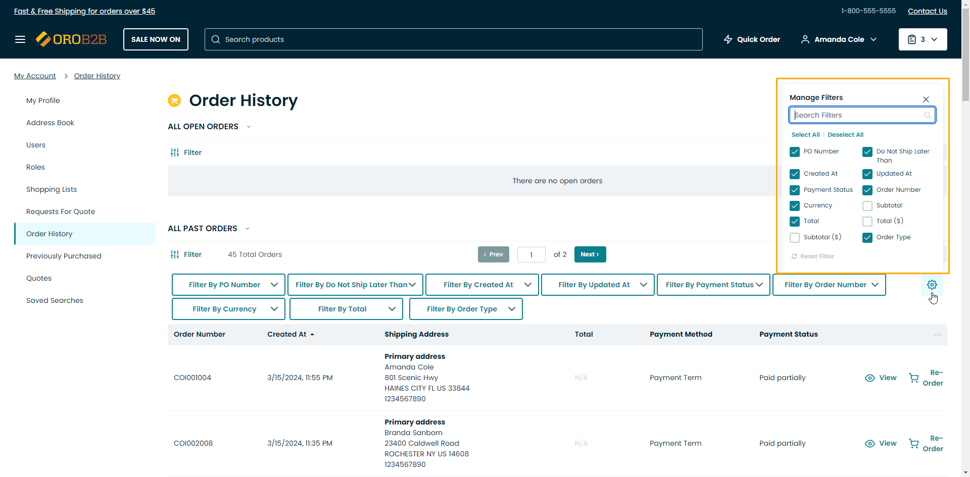
You can manually select the columns by clicking on the checkbox next to the required field.
To show/hide all columns in the table, click Select All/Deselect All.
To clear customization, click
Reset.To change the order of the columns, click on the ellipsis icon next to the name of the column you wish to move, hold the mouse button, and drag the column to the required position.
Filters: click
 to show/hide filters to select specific items to be shown in the table. More information on filters is provided in the Filters section below.
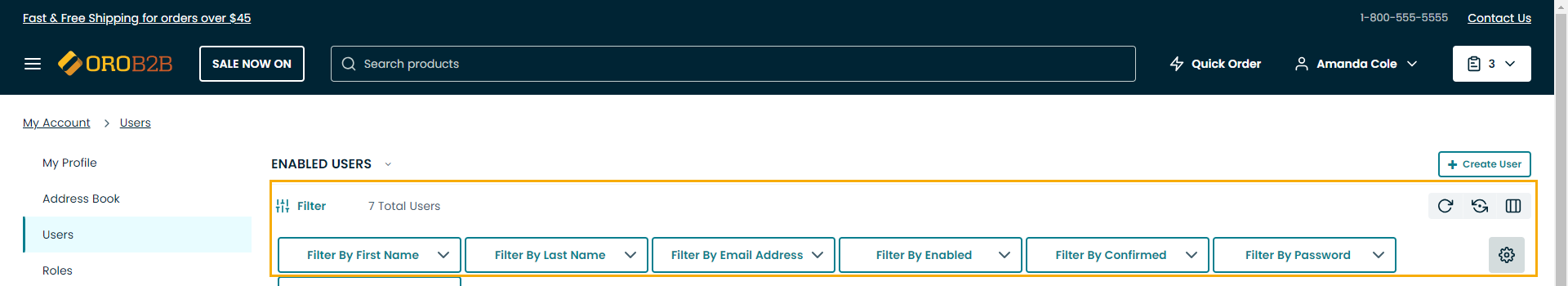
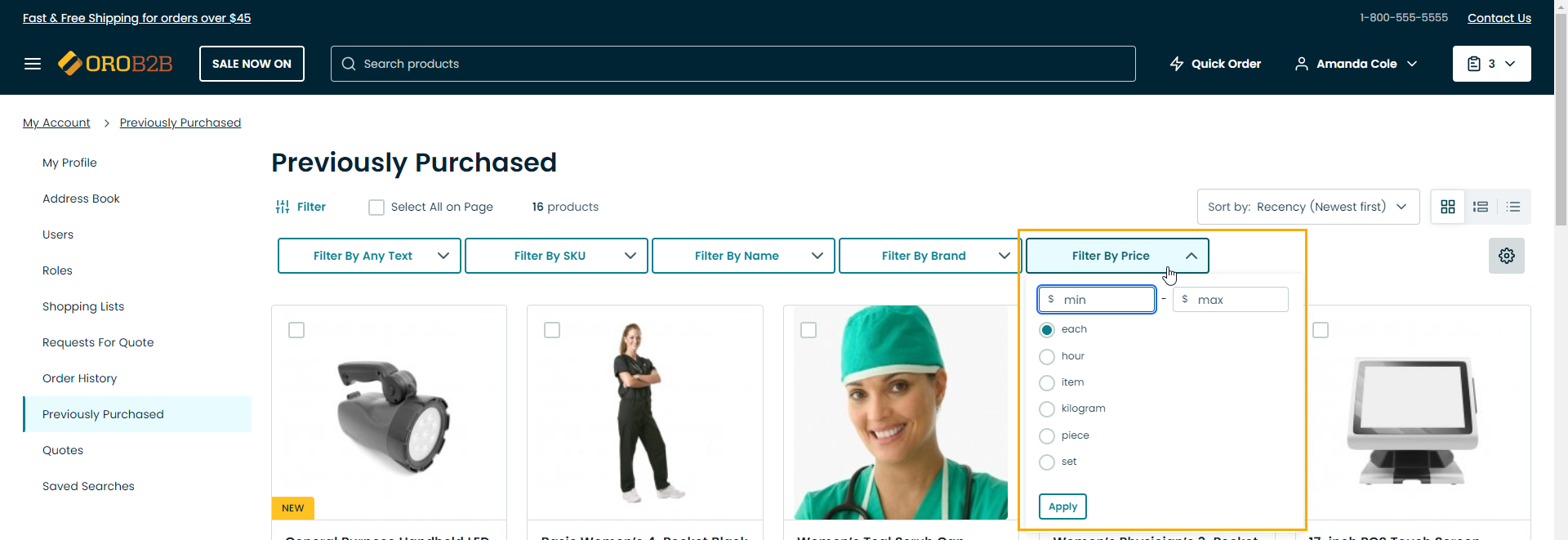
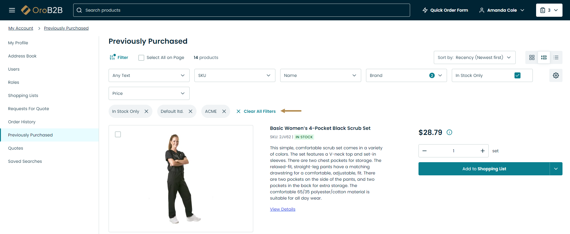
Filters
Filters are used when you need to quickly pick out the records you need from the entire data pool.
The following actions are available for filters:
To show/hide filters, click the filter toggle icon
 .
.
Note
Note that not all filters may be visible by default.
To apply a filter, click on its button in the bar and select the required option from the dropdown list.
Note
The dropdown list displays all the attributes available for the products on the page you are currently viewing. If there no products related to the searching attributes, the attributes may be hidden from the dropdown list or remain visible but disabled depending on the website configuration when no items matching selected attributes in filters were found.
The appearance of filter controls may vary based on the type of data being filtered, such as text, numbers, dates, or options. Applied filters are displayed under the filter controls.
To remove a filter, click on a cross x after the query. To reset all applied filters, click x Clear All Filters.
Hint
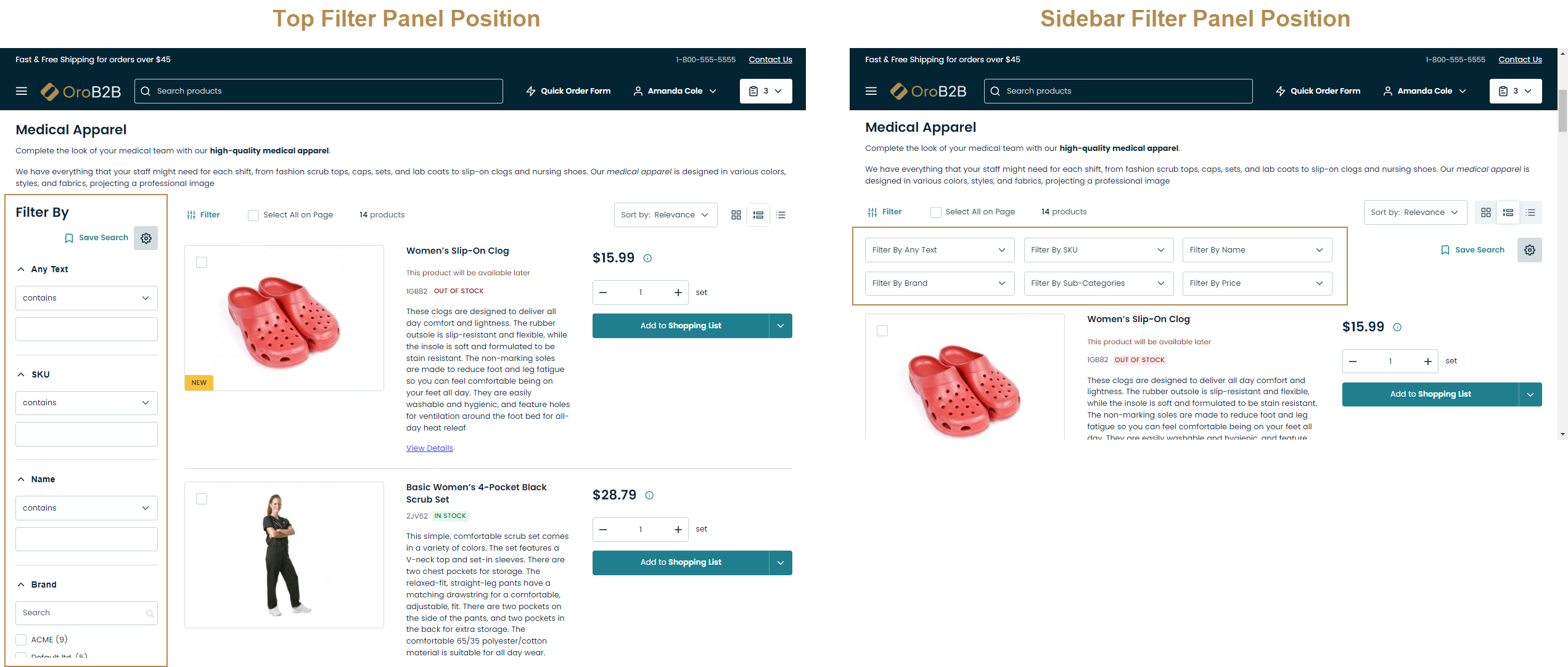
Filter in the storefront can be displayed either at the top (default) or in the left sidebar, depending on the Filter Position configuration applied in the back-office theme configuration.
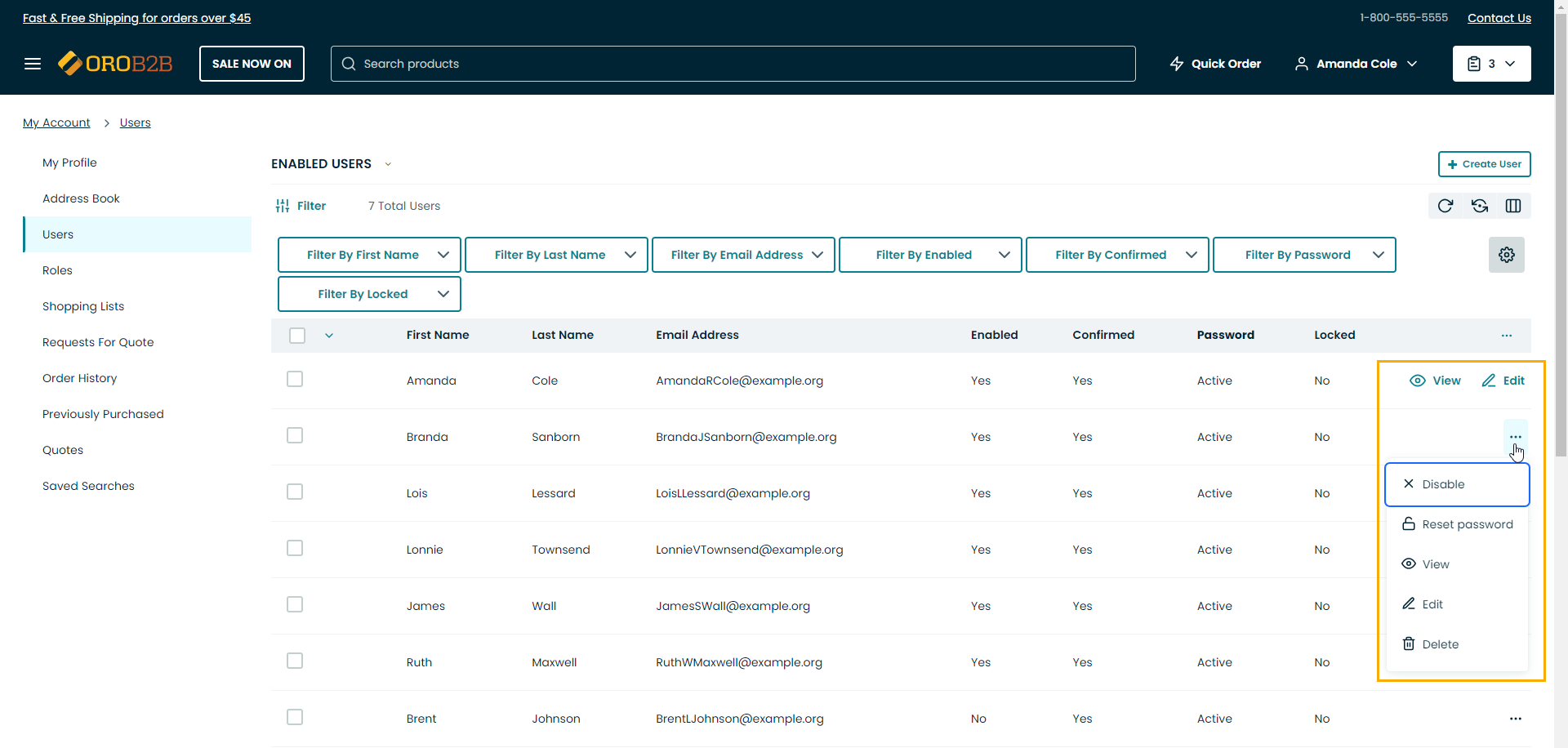
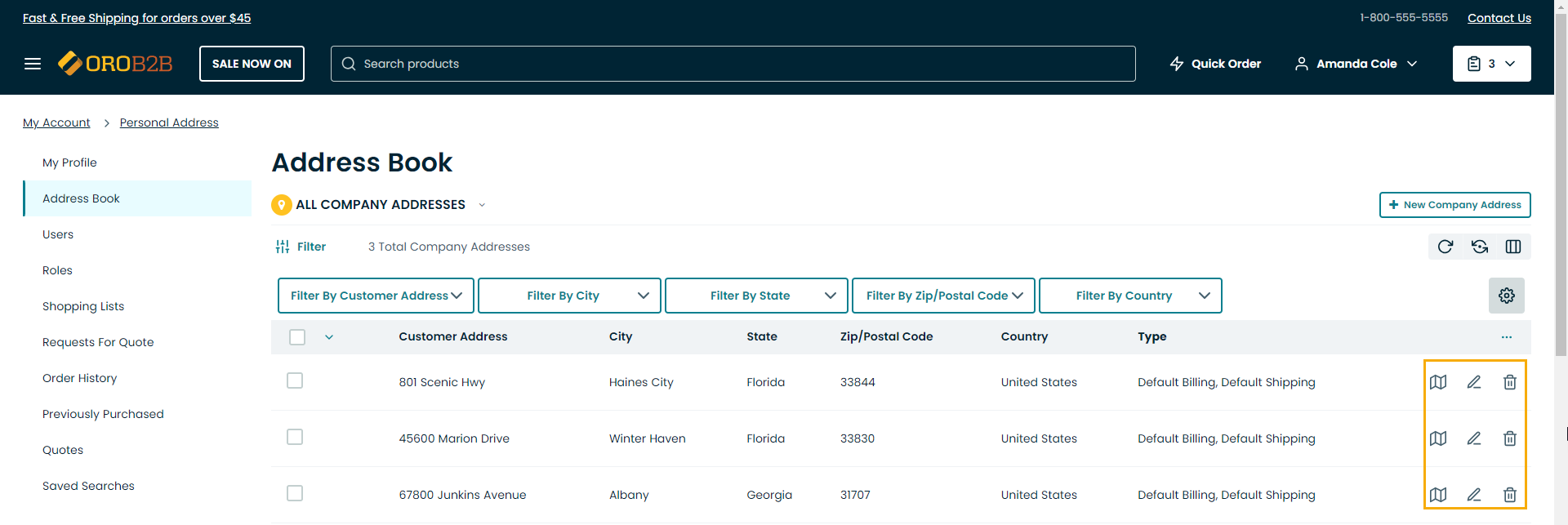
Grid Options
View tables usually contain one or more options applied to specific records within them. These options take the form of individual icons or icons within the ellipsis menu that can be collapsed.
Note
The types of options available are subject to the type of data contained in the table and to the system configuration.
Mass Delete in Tables
With mass actions, you can apply one action to multiple items at the same time, which can simplify and speed up the process of selecting the required items.
In the storefront, mass delete action is available in the Address book and Users sections only for the registered users.
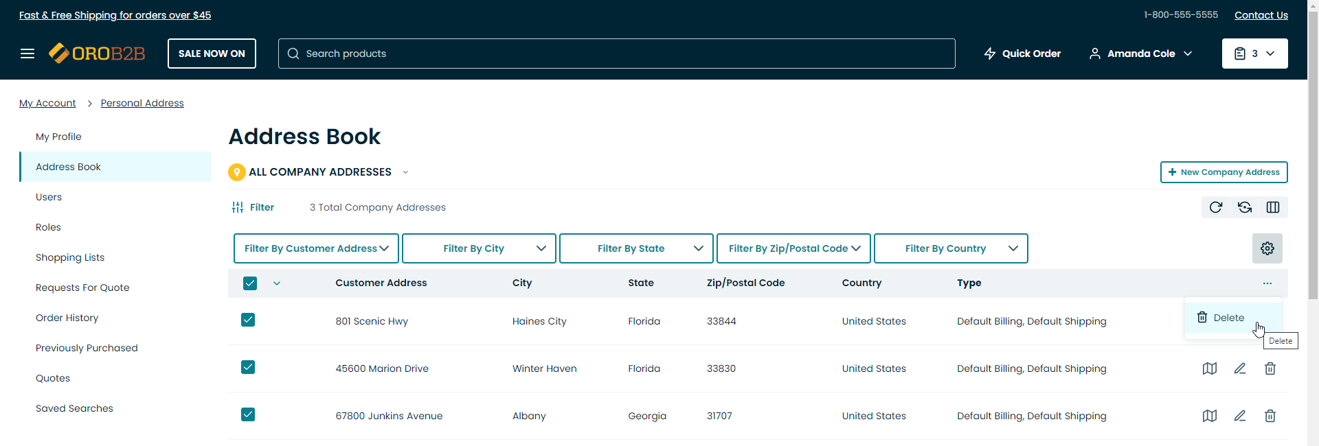
To use mass delete action in the storefront, you need to be logged into the storefront account.
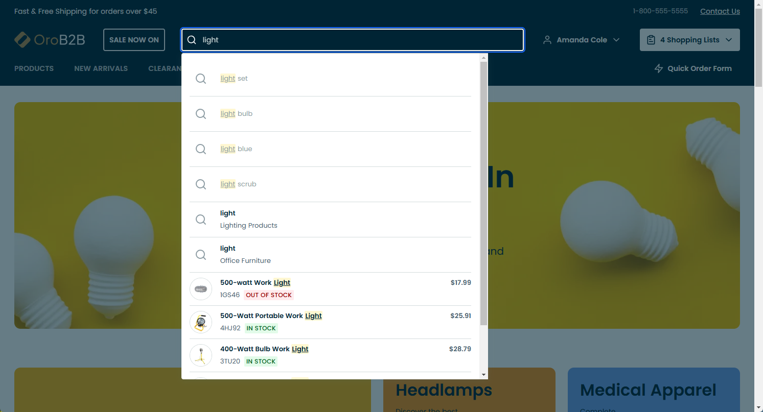
Search
Search is the fastest way to find a specific product:
Click the
 search icon at the top of the screen.
Type in the search key into the text field.
Click Enter.
The search shows up-to-date product information, such as SKU, name, price, and inventory status.
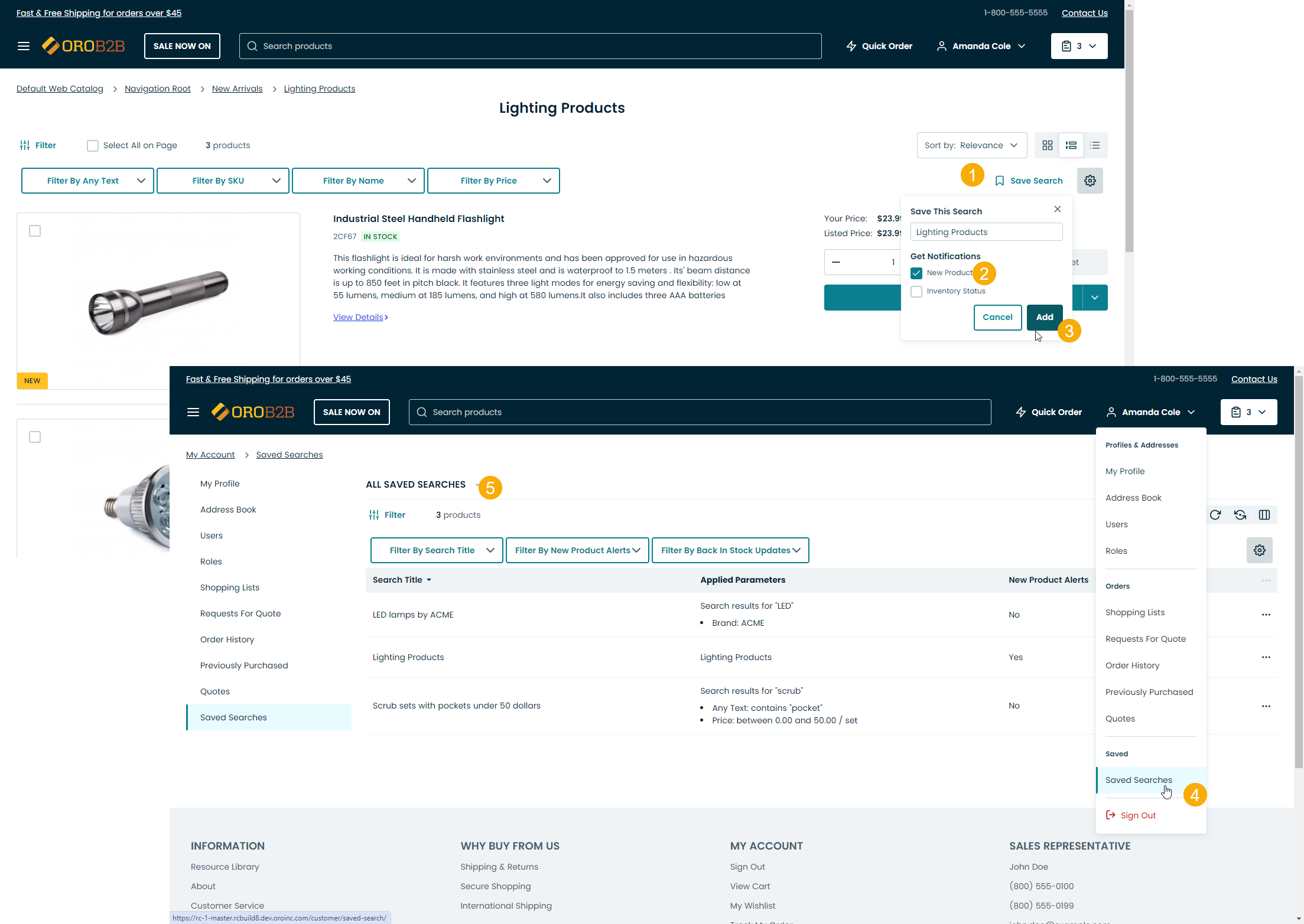
Saved Search
Note
The feature is only available in the Enterprise edition applications.
Customer users can save search queries, return to these saved search queries later, receive notifications when a new product falls under the search conditions and when products from the search query result are back in stock.
To save a search result:
Use the search bar to look for a product name, SKU, keyword, etc.
When the search results are displayed, click the Save This Search icon on the top right.
Select the checkboxes for New Product and/or Inventory Status if you want to receive notifications.
Click Save. Your search query is now saved under My Account > Saved Search.
Product Data Export
Registered customer users can export products, their prices, and price tiers into a .csv file from the storefront product collection and search results pages, if option Product Grid Export is enabled in the back-office settings.
To download a product data .csv file:
Click on the download icon on the top right of the product grid.
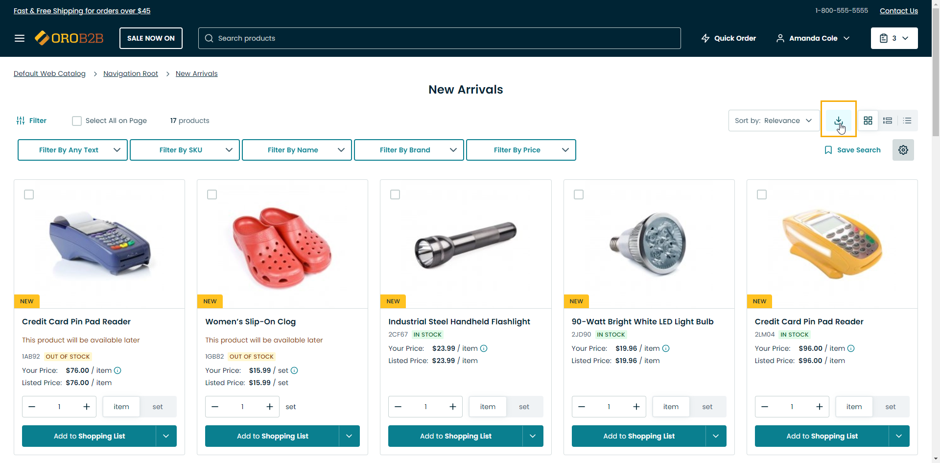
Check your inbox for instructions on how to download the file.
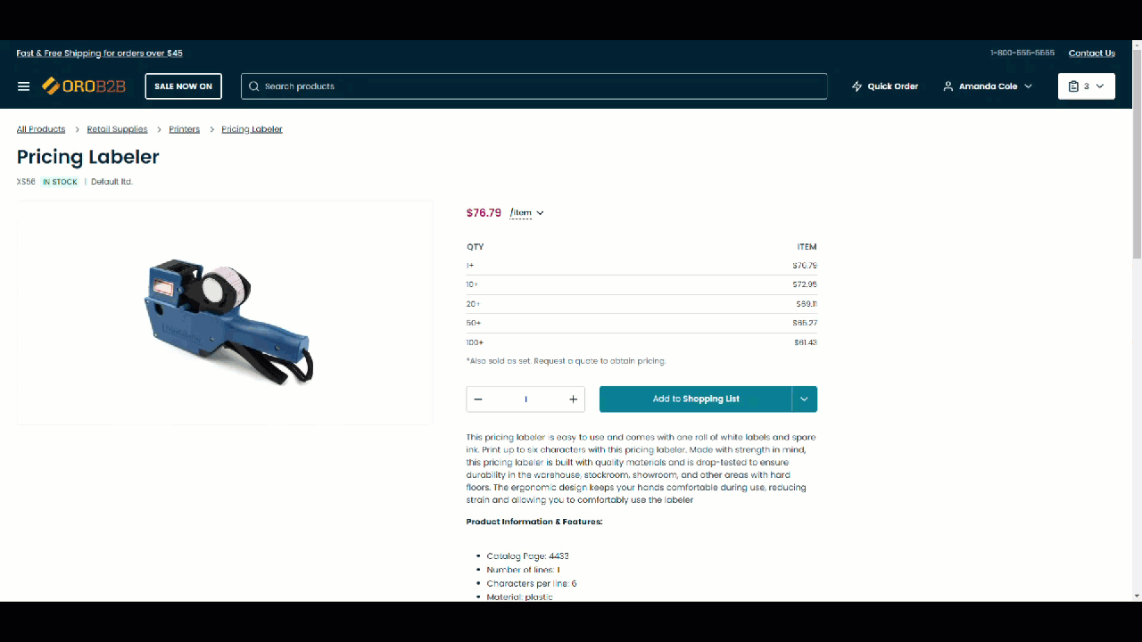
Product Price
In the storefront, price per item may change depending on the number of items you want to purchase where in the price tier the quantity falls.
Suppose we have one product in the default price list with the following price tiers set in the back-office:
1 item - $76.79
10 items - $72.95
20 items - $69.11
50 items - $65.2
100 items - $61.43
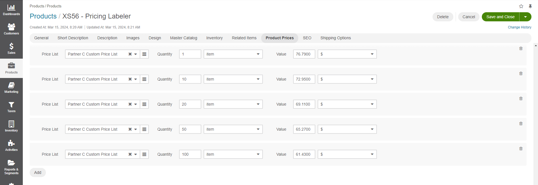
This means that product price per 1 item will change depending on how many items a buyer wants to purchase. The more they purchase, the cheaper the price per item is going to be in this scenario. The following image illustrates how price tiers are going to be displayed for a user in the storefront.
When a buyer tries to change the quantity of the items, this triggers change in the price per item.