Configure Theme Settings per Website
Hint
Theme is configurable on three levels – globally, per organization and website.
In your Oro application, you can control and customize the storefront look and feel per website.
Navigate to System > Websites in the main menu.
For the necessary website, hover over the More Options menu to the right of the necessary website and click to start editing the configuration.
Select Commerce > Design > Theme in the menu to the left.
Note
For faster navigation between the configuration menu sections, use Quick Search.
In the Theme Settings section, configure the following options:
Theme — select the storefront theme from the list. For more details on how to customize a theme from the dropdown list, refer to the theme configuration topic.
Product Image Placeholder — select the image file that will appear on the product listing and product view pages for the products that have no associated images to avoid a blank image page.
Category Image Placeholder — select the image file to be applied to the category that has no associated image. The image is usually used in various category widgets.
In the Page Templates section, select the product page template from the list. Available options are Default, Tabs, Wide.
Important
The Page Templates configuration applies to OroCommerce version 5.1 and below and is retained in the current version only for legacy backward compatibility. For v6.0 and above, please configure this option under System > Theme Configuration.
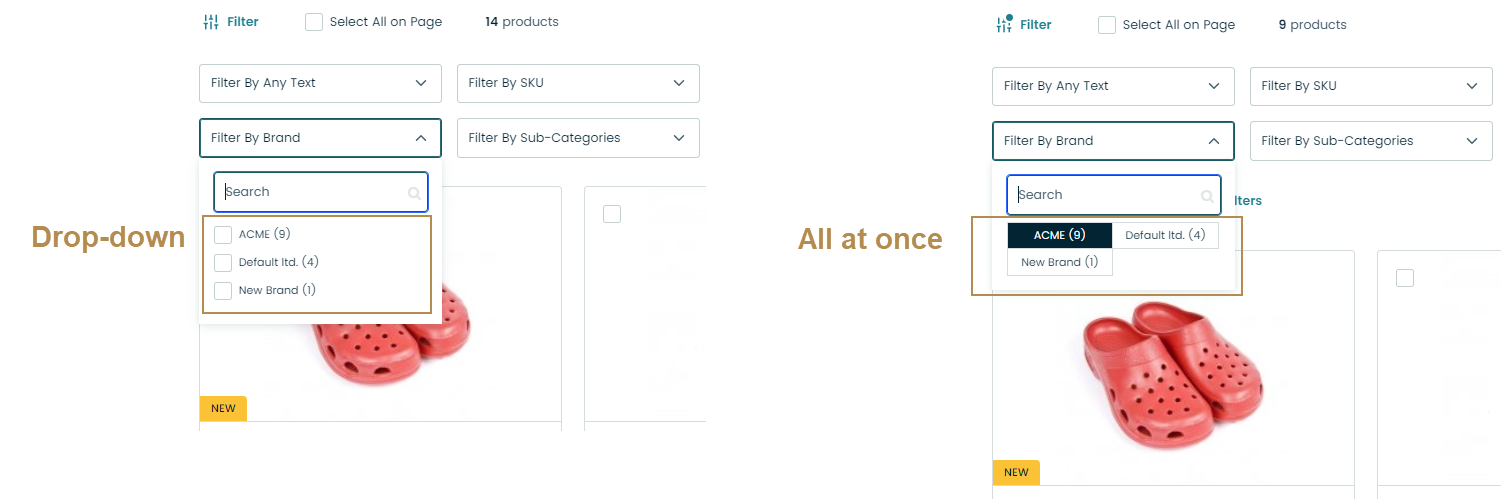
In the Filter Settings section, specify how the multi-select filters should look in the storefront. Available options are Drop-down and All at once.
Hint
To specify where the filter panel should be represented in the storefront, at the top or in the sidebar, refer to the theme configuration documentation.
To control whether to hide or disable product attributes within filters, refer to the filters and sorting settings documentation.
In the Menu Templates section, select the user menu display mode that defines the look and feel of the user menu in the storefront.
Important
The Menu Templates configuration applies to OroCommerce version 5.1 and below and is retained in the current version only for legacy backward compatibility.
Click Save Settings.